

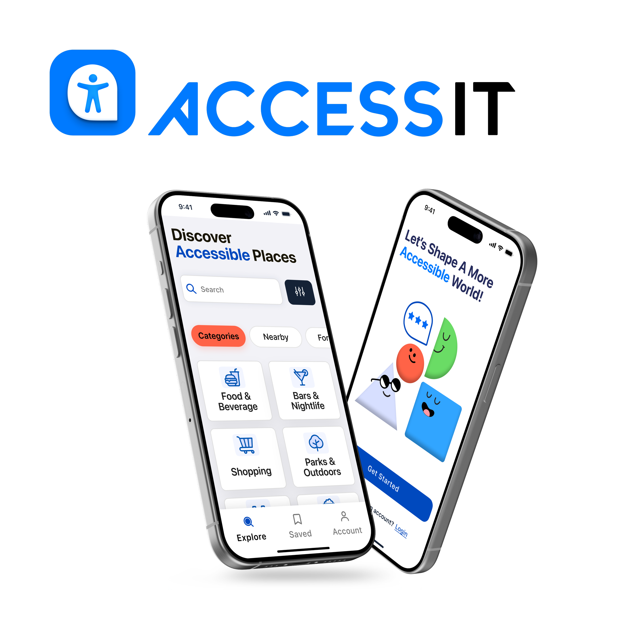
Project Overview
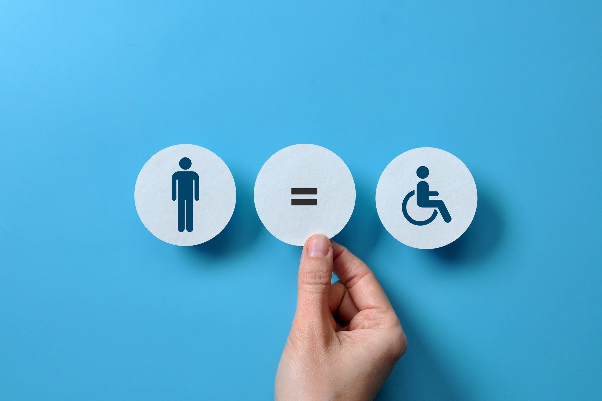
AccessIt is a review-based mobile app for ADA-accessible activities and places. Users can discover, rate, and contribute to the accessibility of various locations, helping to create a more inclusive and welcoming environment for people of all abilities. The app ensures that users can make informed decisions about where to go based on their specific needs.
My Role:
I designed the entire project, from concept to completion. This included handling both the UX and UI design aspects. The project's goal was to develop a mobile app that would function smoothly on both Android and iOS platforms.
Tools


The Concept
During a conversation with a friend about UX/UI design and accessibility, we discussed the lack of apps focusing on people with disabilities and how technology could be better utilized in this context.
This discussion sparked the idea for this app. My aim was to create a user-friendly and enjoyable experience while also providing a guide for users to feel confident when planning activities or visiting places. I was eager to learn the world of accessibility in design, understanding how to create for a diverse range of users with accessibility at the forefront of the process.
Research & Competitive Analysis
During my market research, I came to realize that there are not many apps focused on accessibility. Based on this analysis, there is an opportunity to create an all-access app that combines the strengths of existing competitors, while addressing their weaknesses.

User Pain Points
During the initial research phase, I encountered challenges in recruiting participants from my target audience. As an alternative approach, I focused on studying existing apps, identifying user pain points within them, and addressing these issues in the development of my app.

“ Great Start-I am very encouraged by this app. One shortcoming I see is being able to offer ratings different from those already offered.”
“One thing I think would improve the app is the ability to add photos to the location review. What’s inaccessible to a wheelchair may still be accessible may still be navigable to someone with a cane, photos could help folks out that way.”
“Confusing- There are no instructions on how to add locations, nor does it say you have to be in the location when you add it. ANY kind of guidance would have been helpful.”
Putting the Pieces Together: Define
The Problem
People with different accessibility needs find it hard to get reliable info about how accessible places are. The current info is scattered and inconsistent, making it tough to make informed choices. We need an easy-to-use platform that gives real-time insights on location accessibility, so everyone can move around with confidence and feel included.
The Solution
The goal of this app is to empower people of all ages and abilities to navigate their communities with confidence by providing a user-friendly platform for discovering and assessing the accessibility features of public places. Through real-time insights, comprehensive information, and a community-driven approach, the app aims to encourage inclusivity, informed decision-making, and contribute to the creation of a more accessible and accommodating environment for everyone.
Understanding the User
Getting to know my target audience was the starting point for creating user personas. It helped me understand their needs, preferences, and behaviors, which allowed me to develop accurate and empathetic personas. Creating these personas helped me to ensure the app was designed with the user's needs front and center.


Information Architecture

Once I had a better idea of who my audience was and what my users needed from the app, I started organizing and mapping out the overall functions that would cater to those needs. This involved brainstorming different ideas and features that could potentially enhance the user experience, and then narrowing them down to the most essential ones.
User Flows
My user journey flows centered on three core Jobs to Be Done; helping users discover accessible locations effortlessly, personalize their preferences, and creating a community where users can contribute insights and reviews.
Key
Flow One
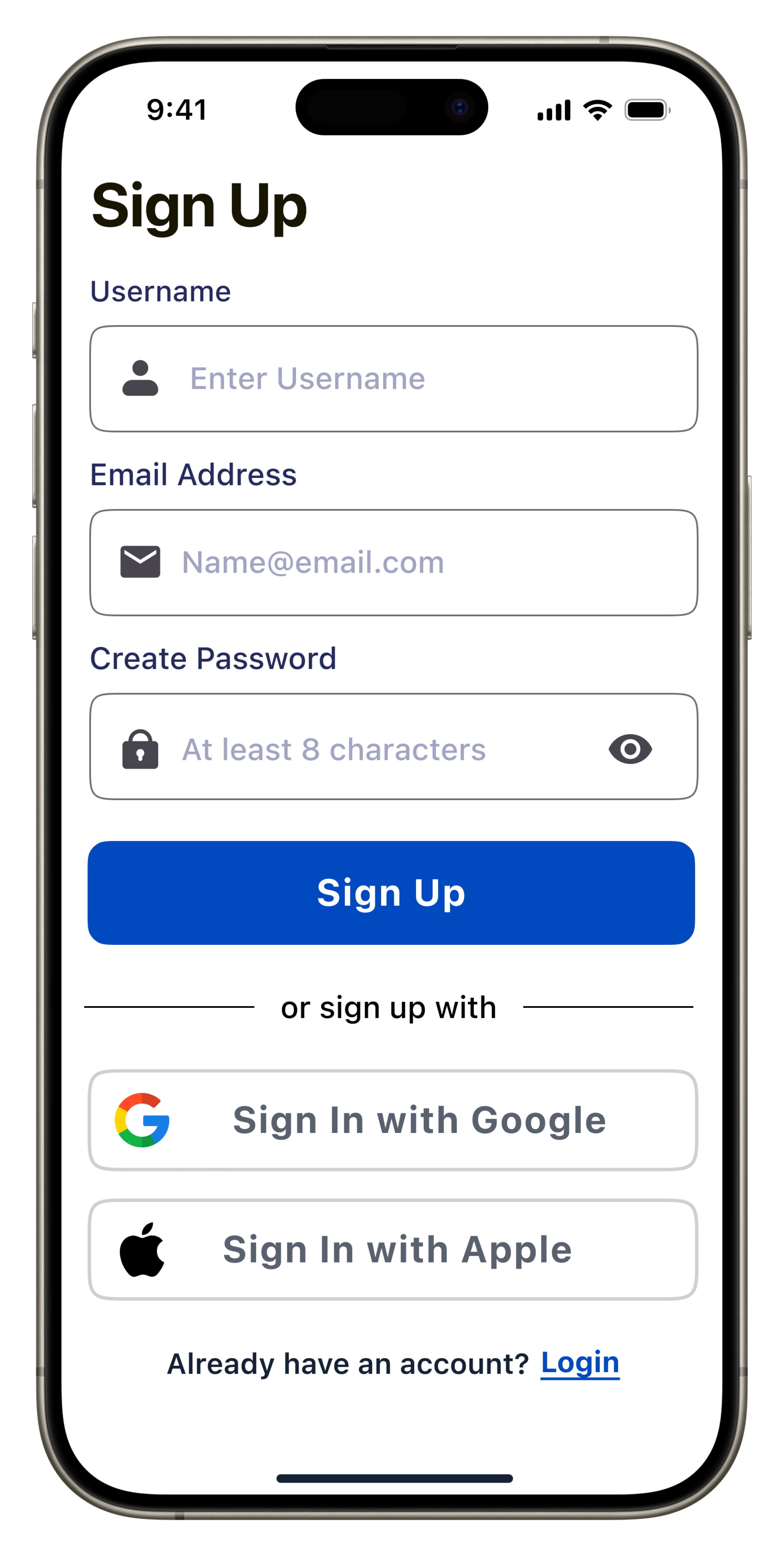
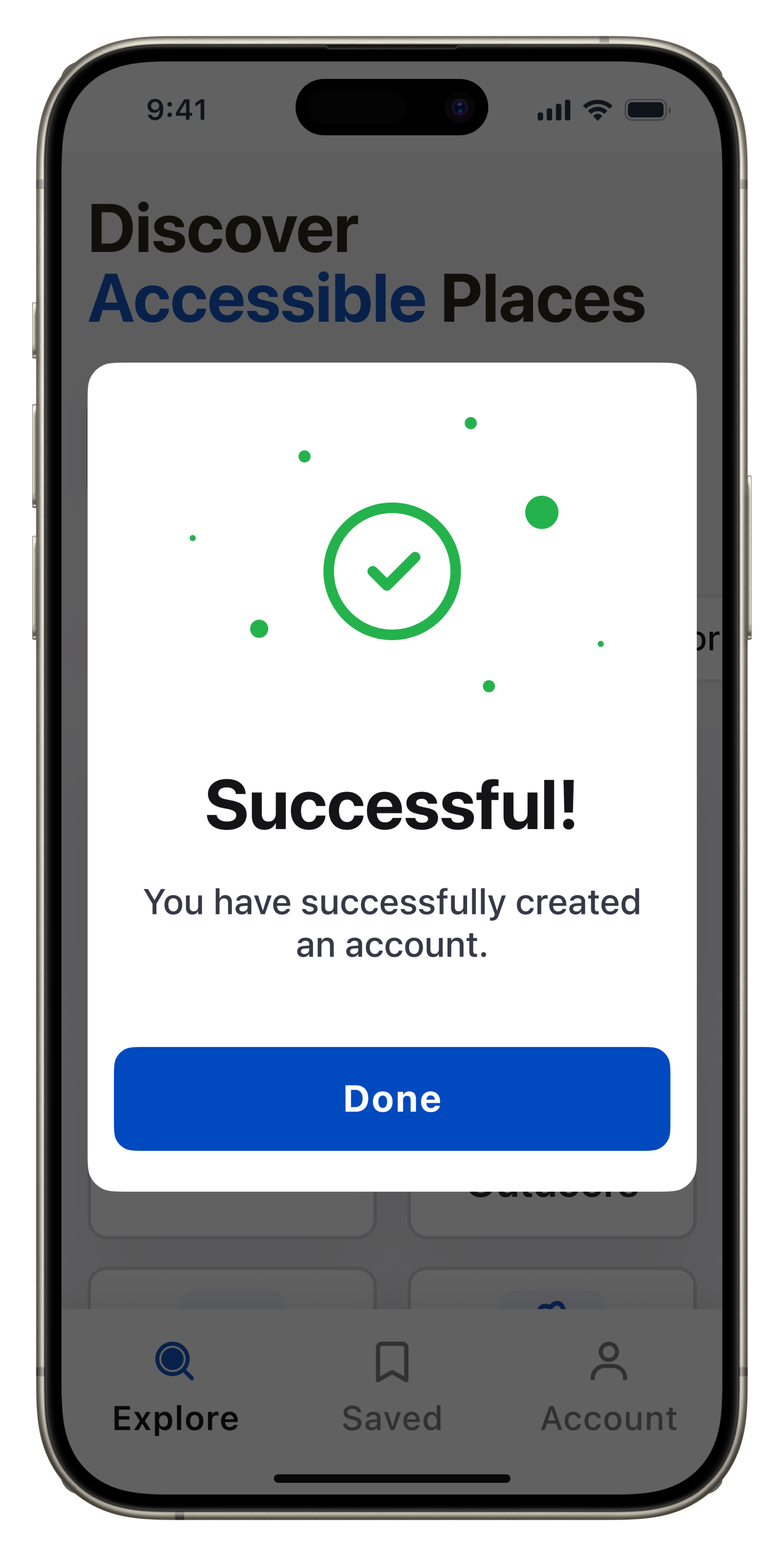
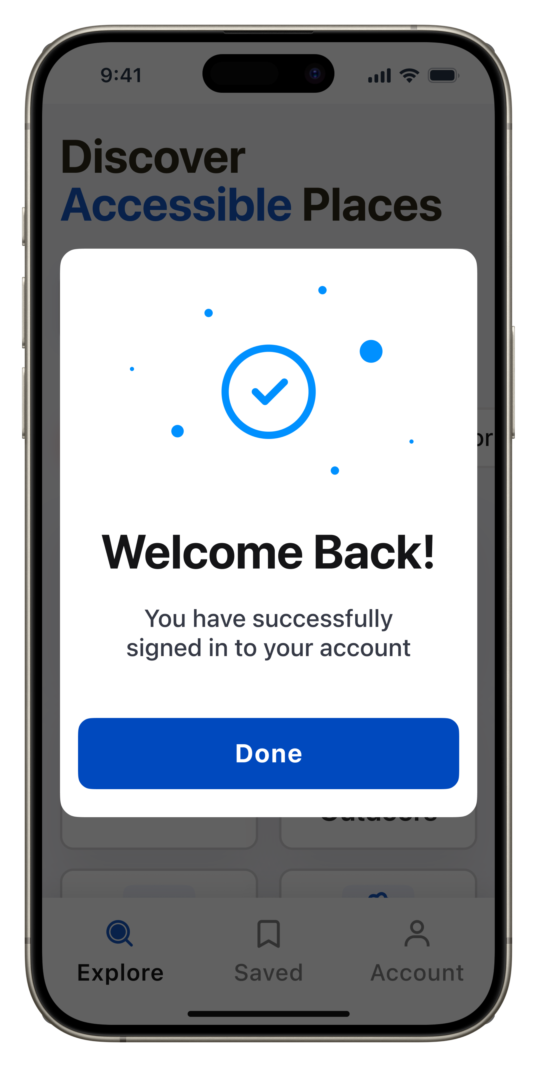
Create Account
Goal: "I would like to personalize my experience and save my favorite locations.”
Success: I have successfully created an account and recommendations match my preferences, and I can save favorites."

Flow Two
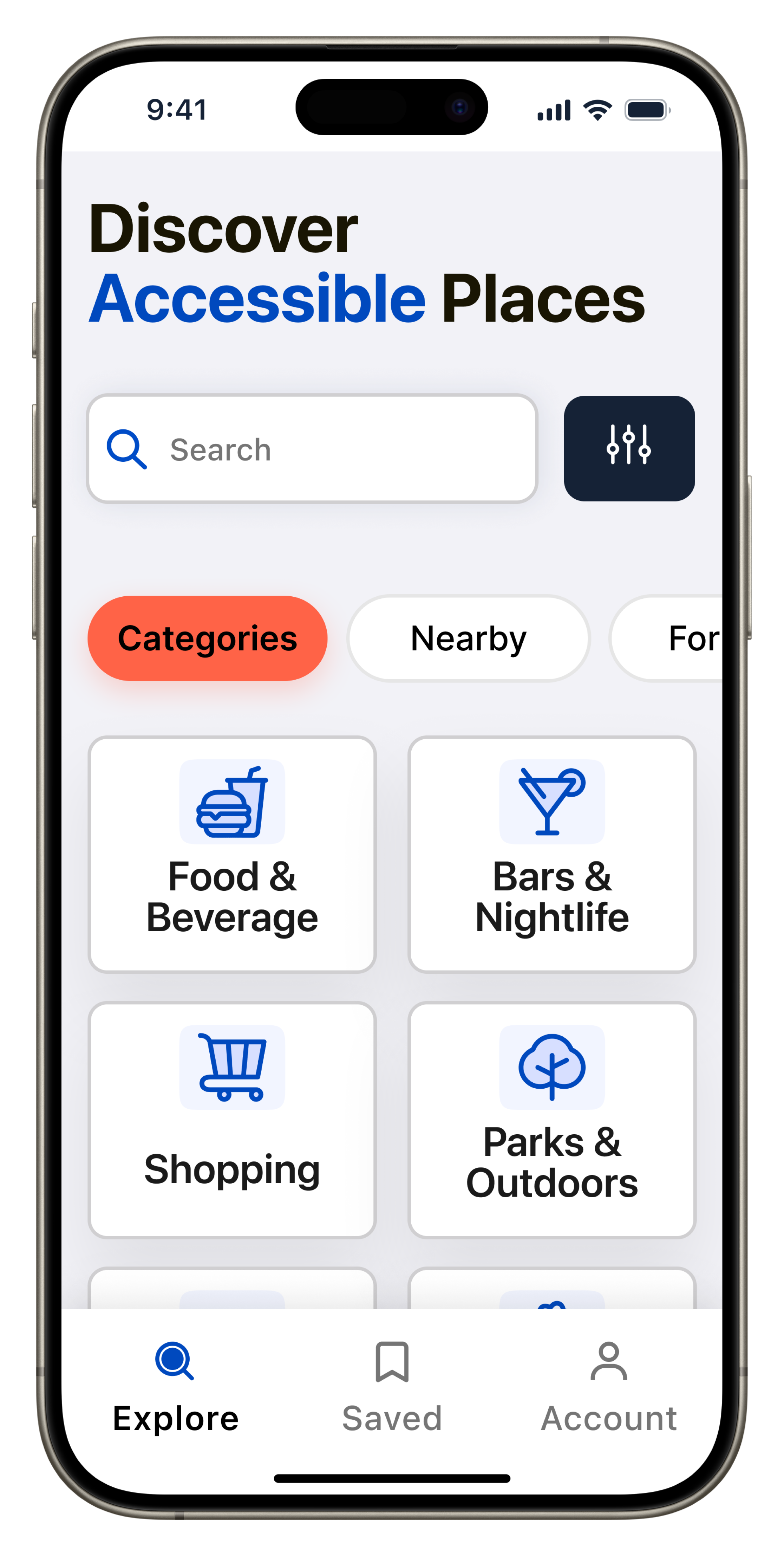
Search Locations, Apply Filters, or Browse Nearby
Goal: "Looking for locations – searching, filtering, or checking nearby.”
Success: “Found the location I want, and filters helped narrow options."

Flow Three
Read/Leave Reviews
Goal: "I’m curious about this place – checking reviews, accessibility tags, adding my thoughts, or reporting issues."
Success: "I’m better Informed now! Reviews and tags gave insights. I will leave my own review to help other users.”

Learning
Before diving further into the design work, I recognized the need to gain a better understanding of accessibility. It was essential for me to learn more about what it means to design for all individuals. To start, I researched various sources including government websites, the iOS Human Interface Guide, and Android Material Guidelines. Fortunately, I also had an adjunct professor who is an accessibility expert to guide me toward the best resources. Although I know I barely scratched the surface, this process significantly enhanced my comprehension of how to improve the design of my product with accessibility considerations.
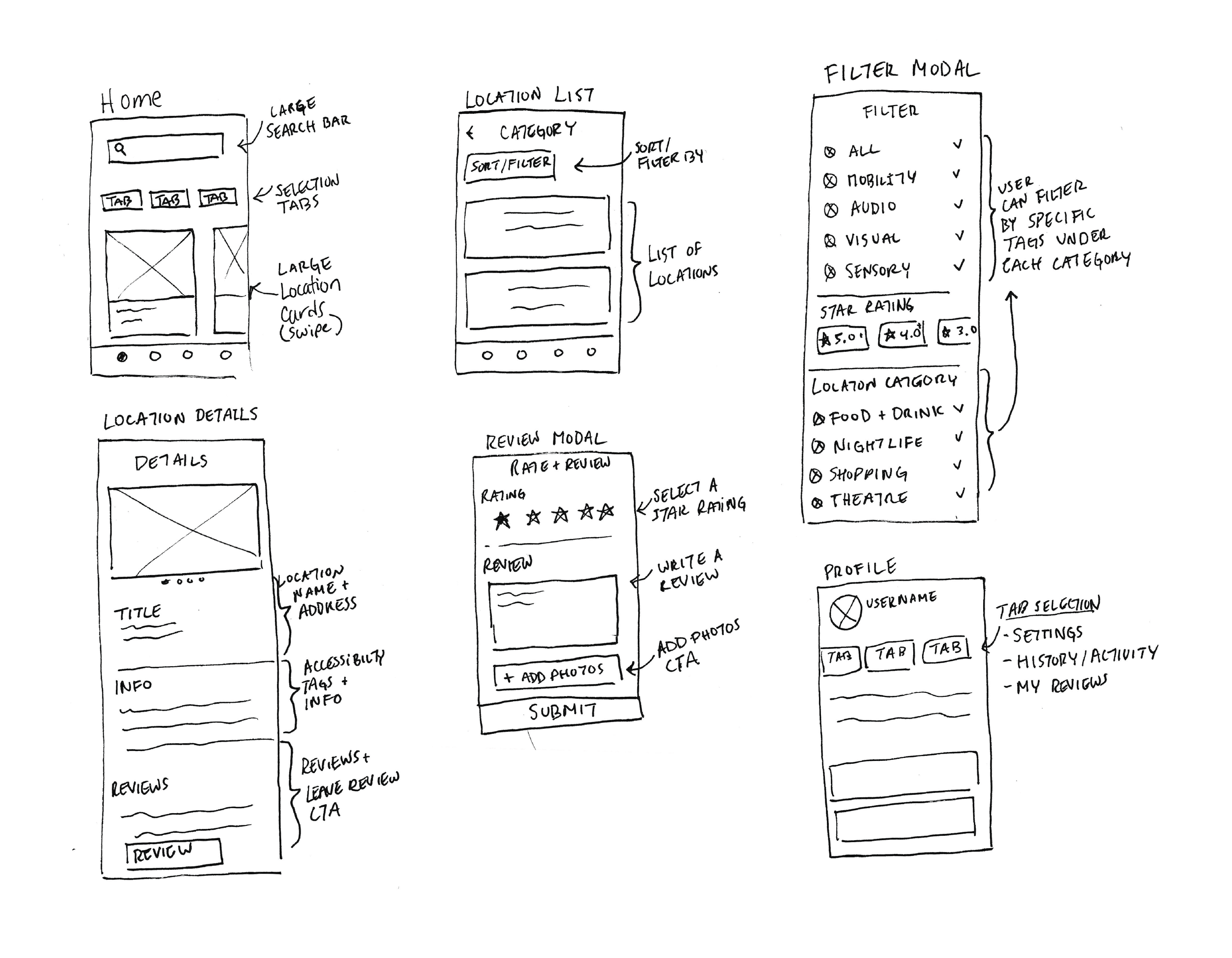
After I gained a better understanding of designing for accessibility, I began creating rough sketches to visualize the app's structure and flow, starting with the main screens and features.
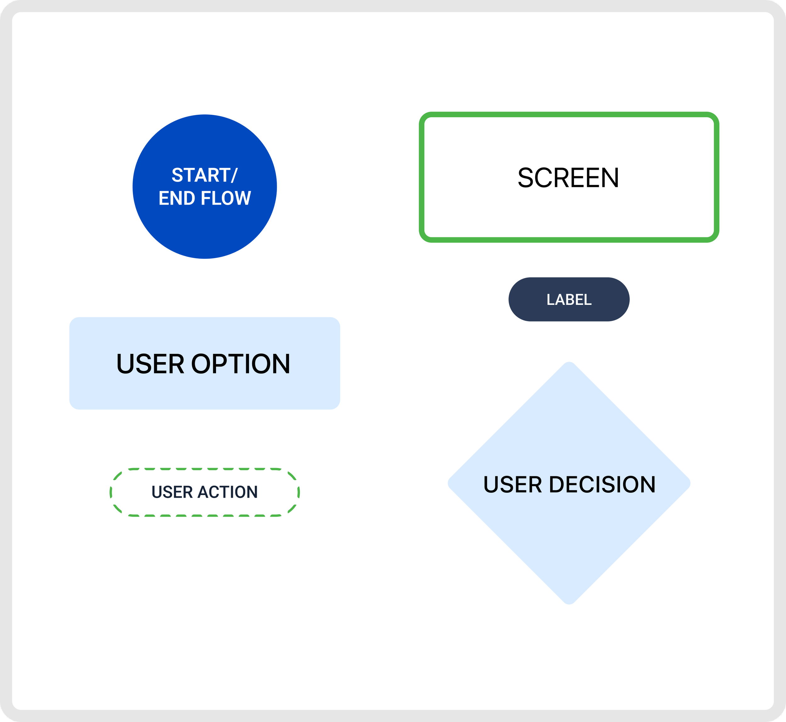
Ideate & Wireframe
Mid Fidelity Wireframes
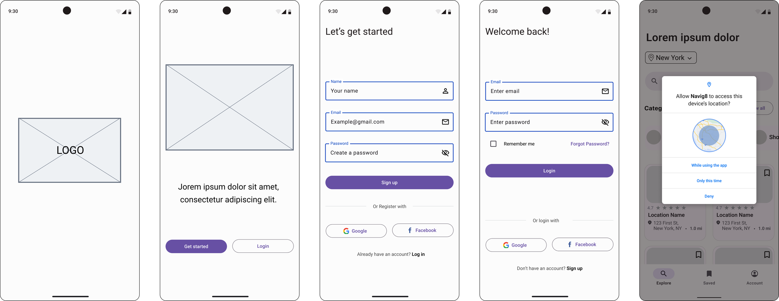
Once I had a visual direction in mind, I created mid-fidelity wireframes for both IOS and Android, ensuring that I followed the correct design patterns for each platform's guidelines.
Platform: IOS
Guidelines: Human Interface IOS 17
Platform: Android
Guidelines: Material Design 3

Sounds and Haptics
Since my app is designed for users who require accessibility accommodations, haptics, and sound will be required for all call-to-action and screens. Users will have the ability to customize sound settings and haptic feedback, such as volume, and the option to enable or disable certain cues. All of these settings can be adjusted through the app's settings or the user's device phone settings.

Sound Direction
CTA Button presses: When a user presses a button, there will be a subtle sound when buttons are pressed, reinforcing the action taken.
Warnings and notifications: For alerts, or notifications I want to use distinct but recognizable sounds.
Haptics Direction
CTA Button presses: I want subtle but distinct haptic feedback when a button is pressed, confirming the action.
Menu selections: a different haptic pattern or intensity when a menu item is selected to differentiate it from a button press.
Alerts and warnings: For these, I would have a more noticeable and attention-grabbing haptic for alerts, or critical information.
Style Guide


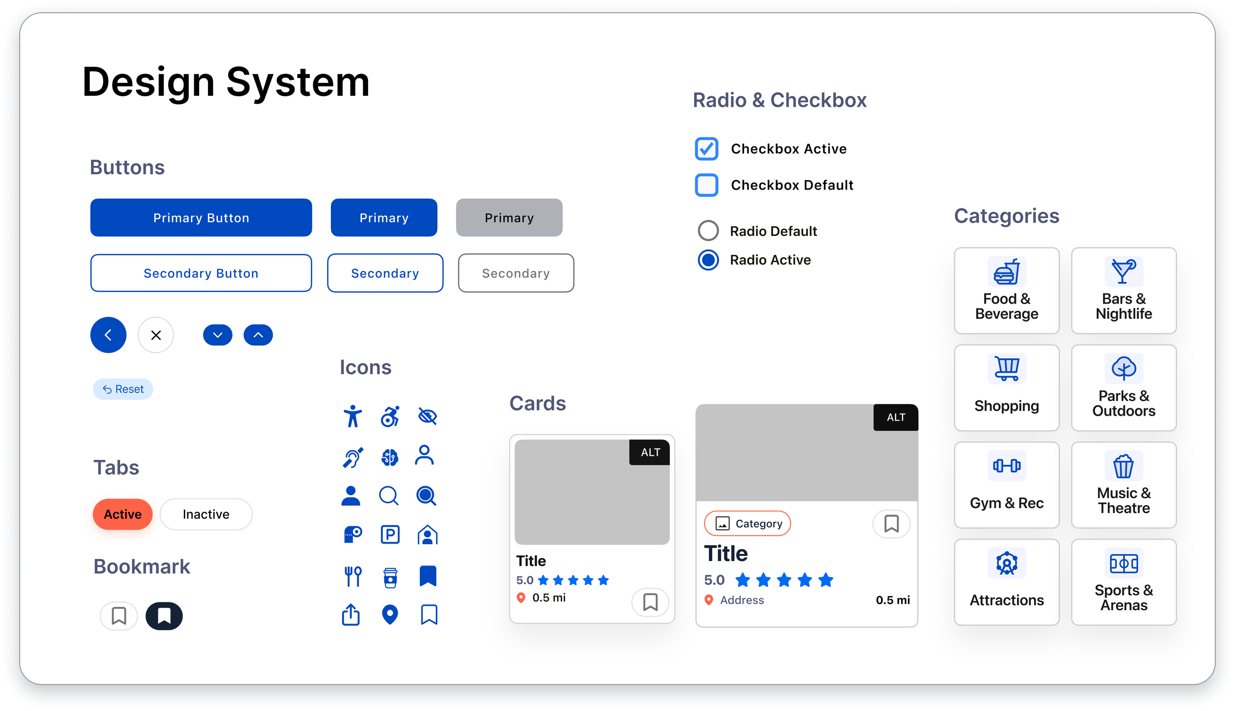

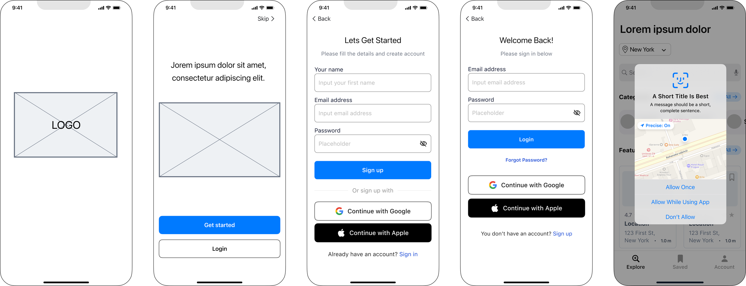
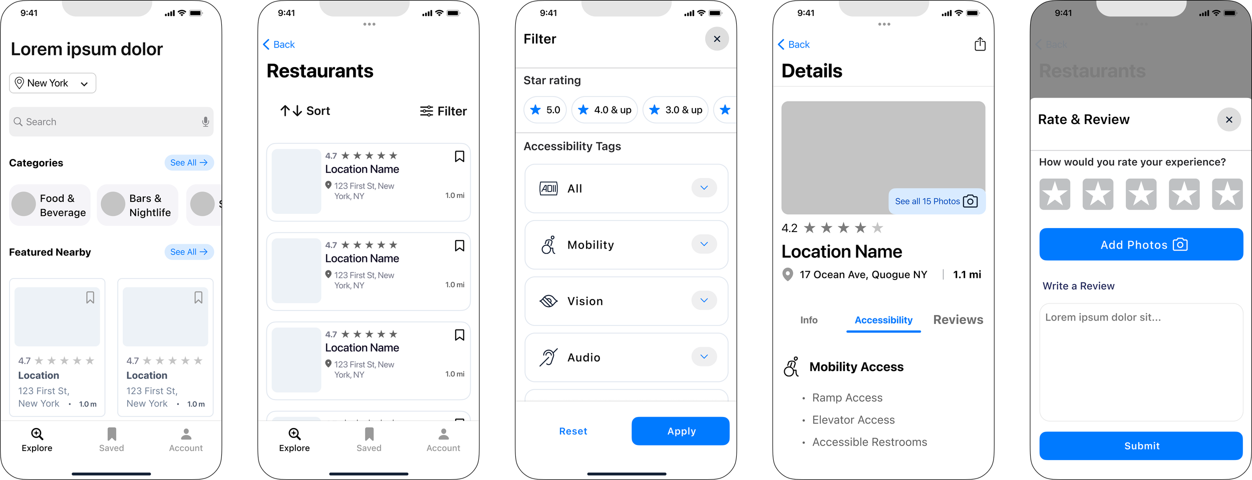
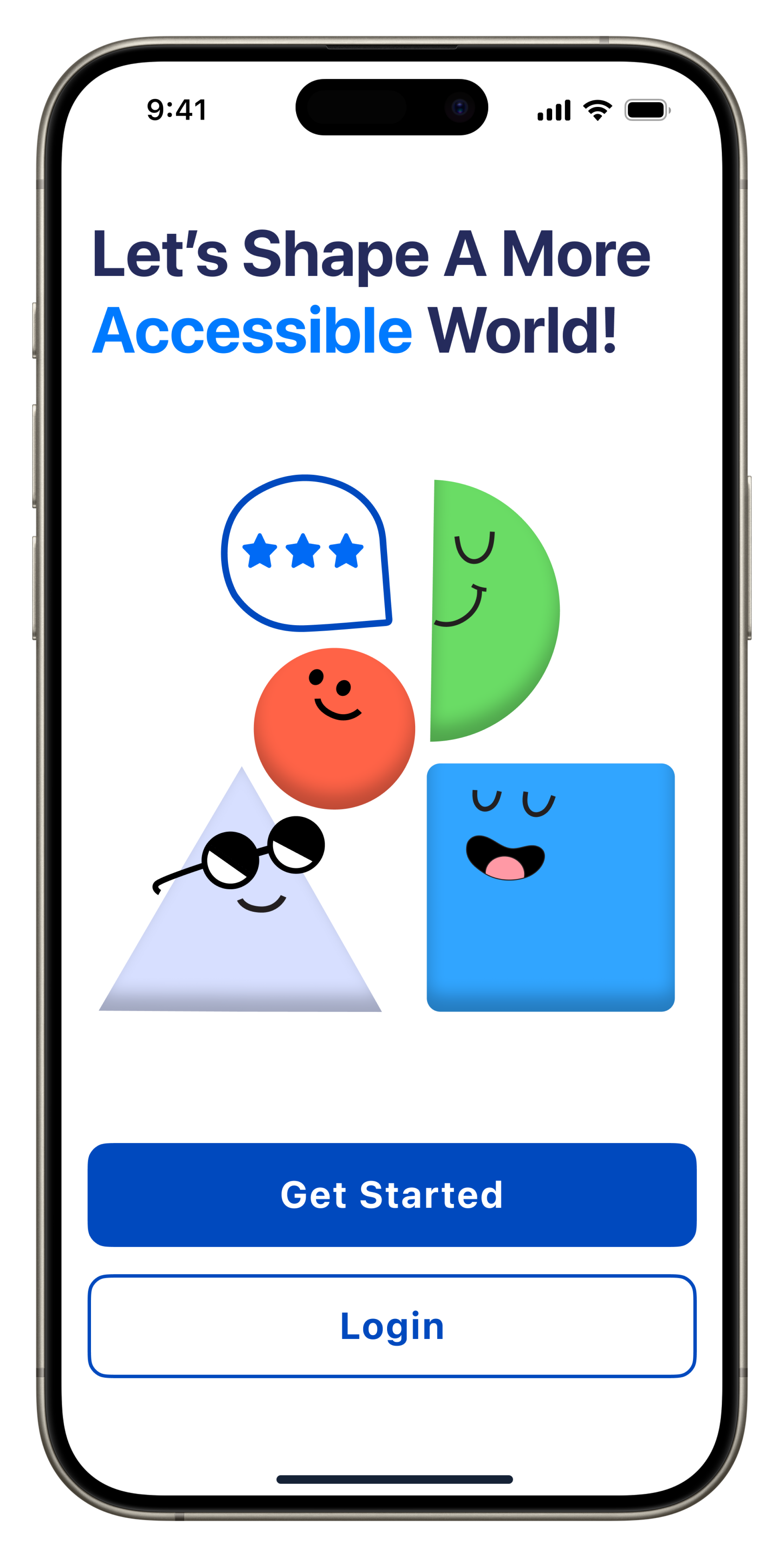
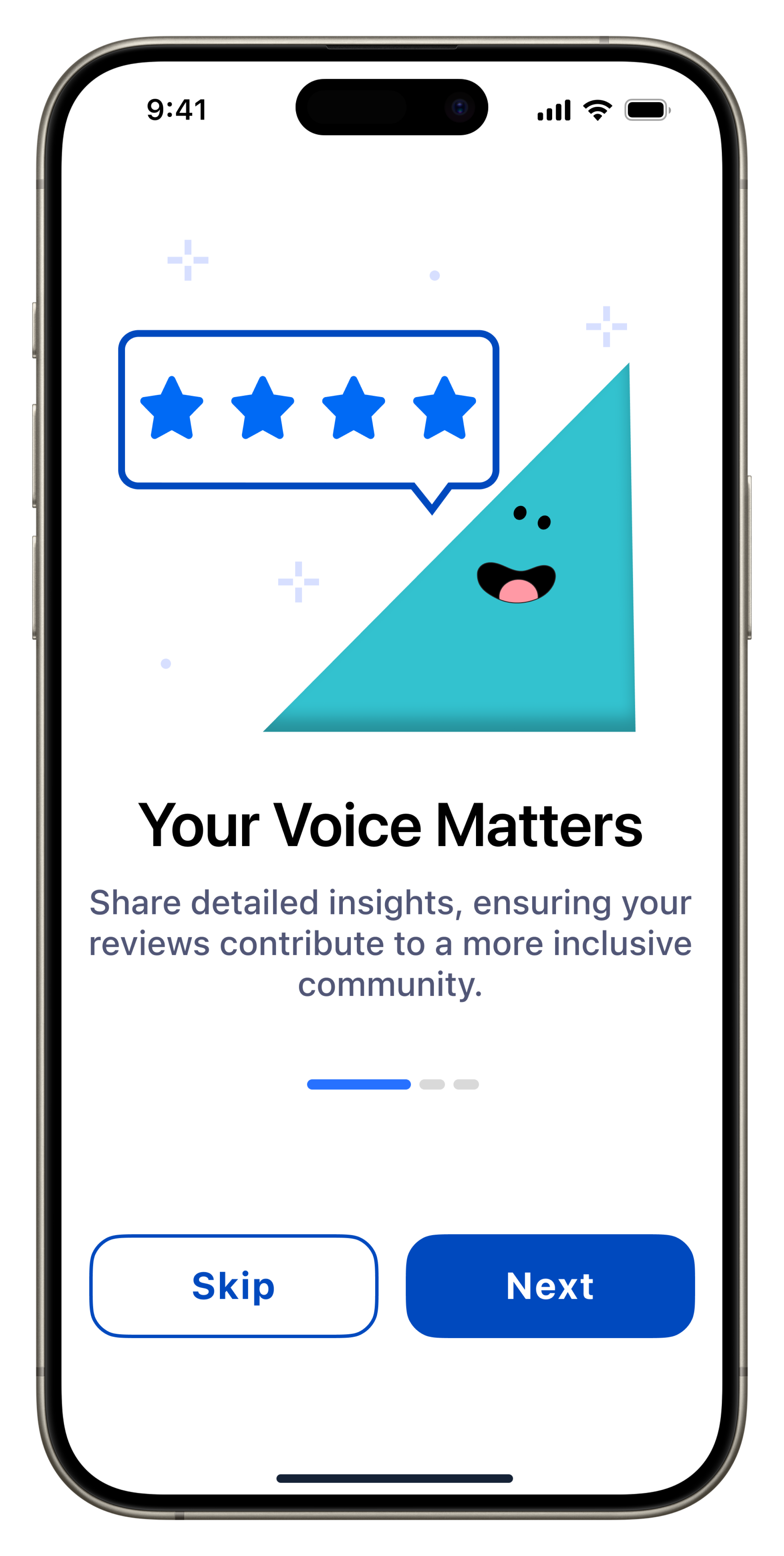
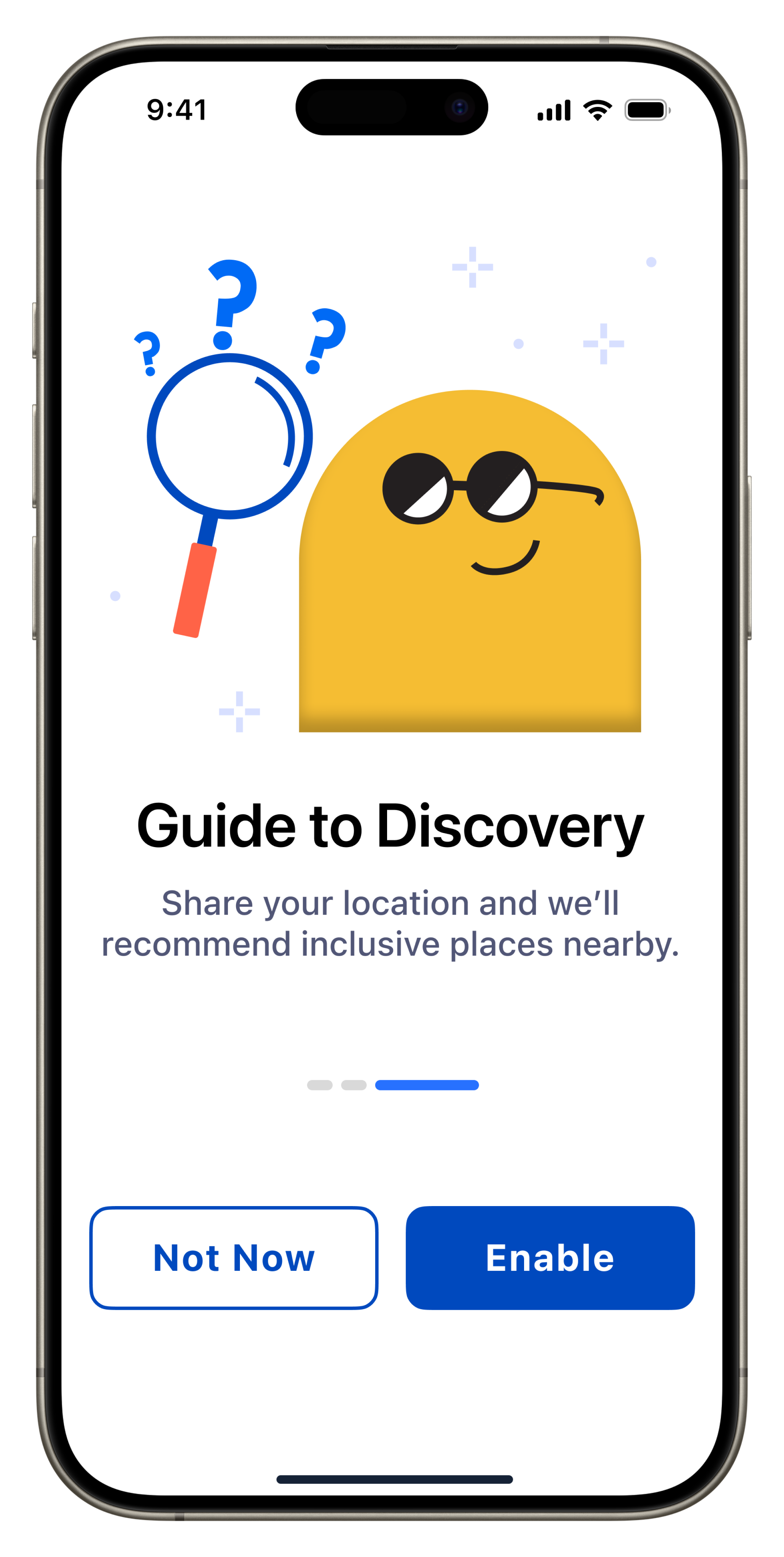
Final IOS Screens
Onboarding


Create Account/Login

Home/Explore

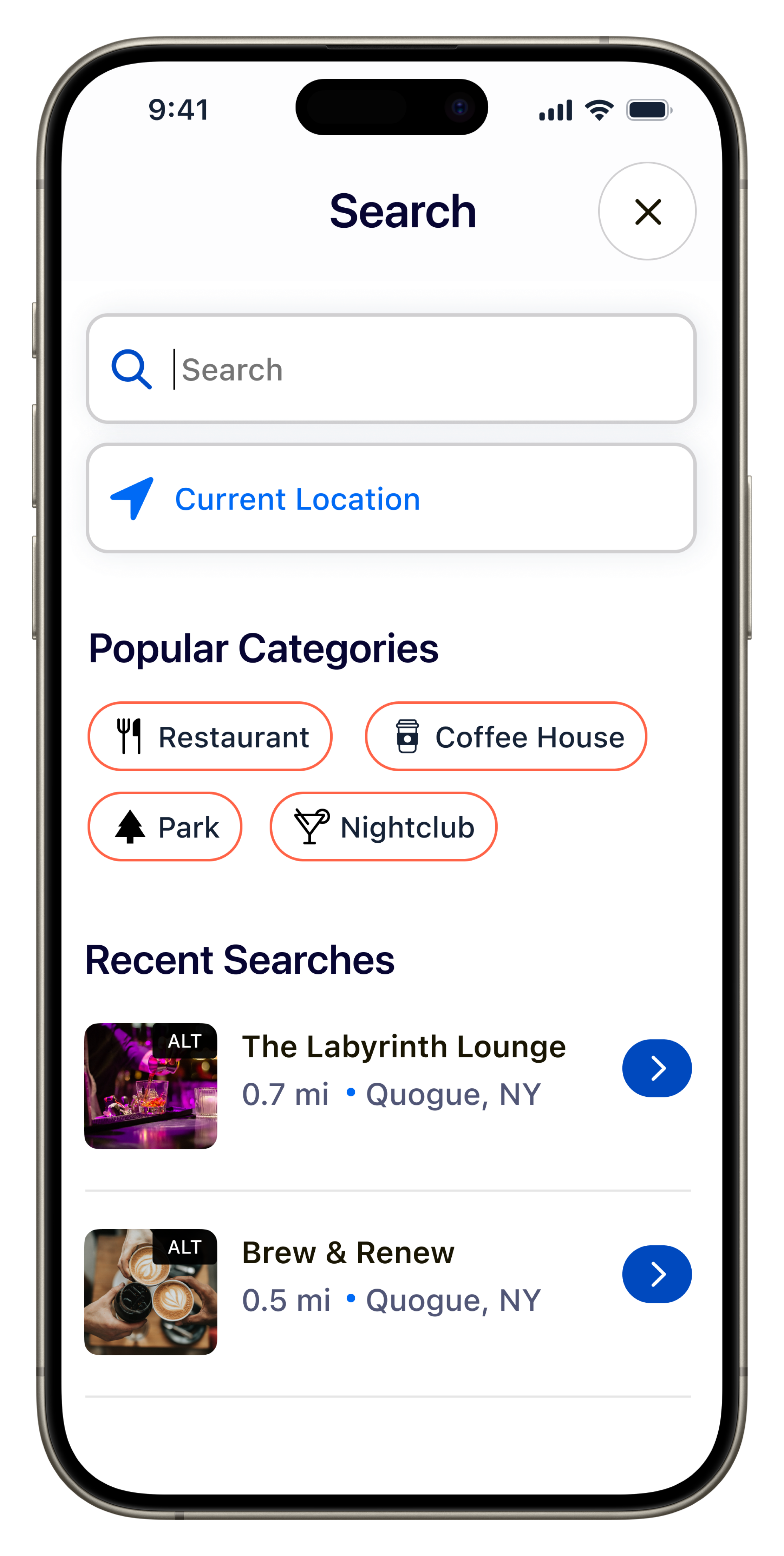
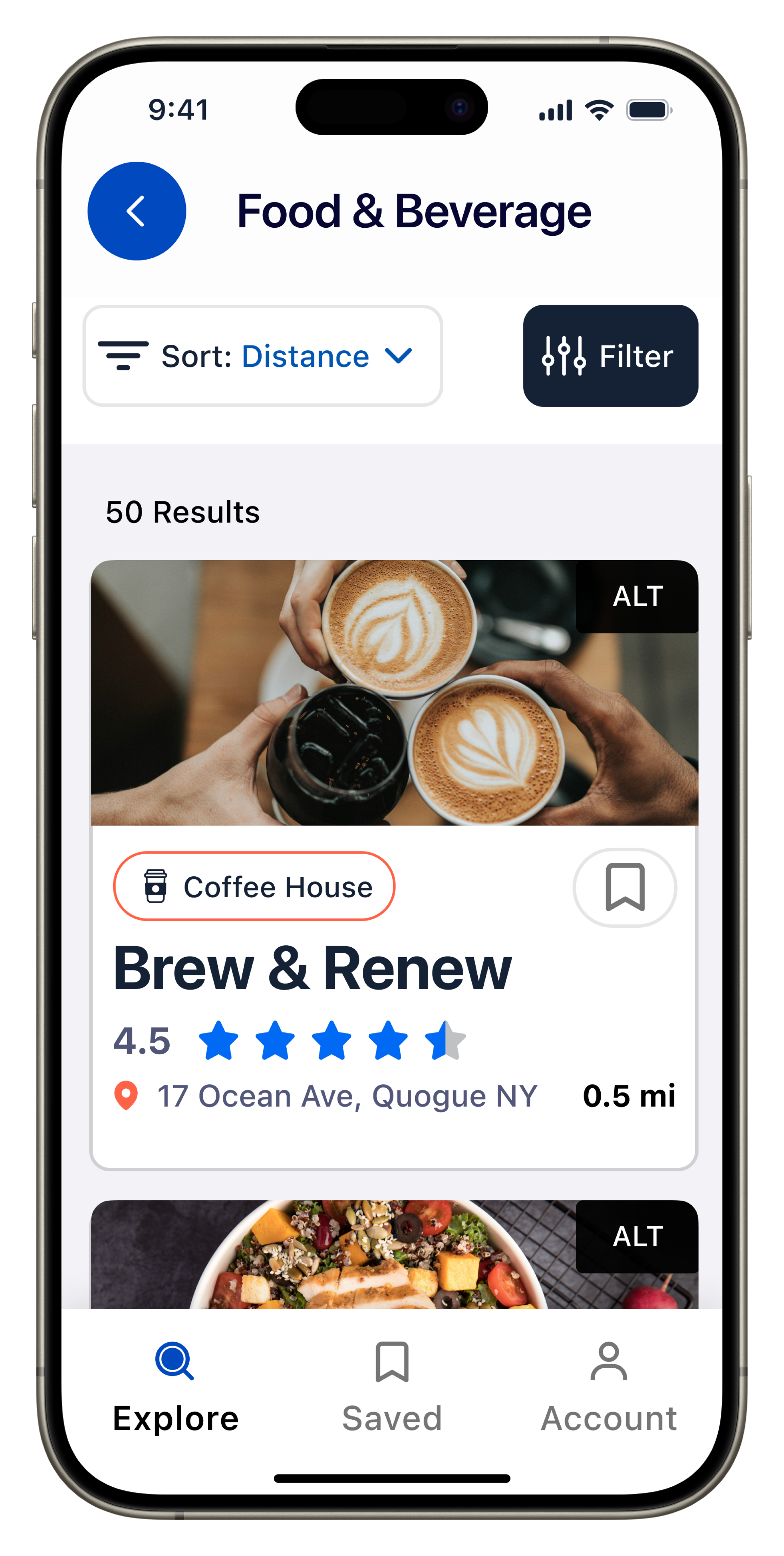
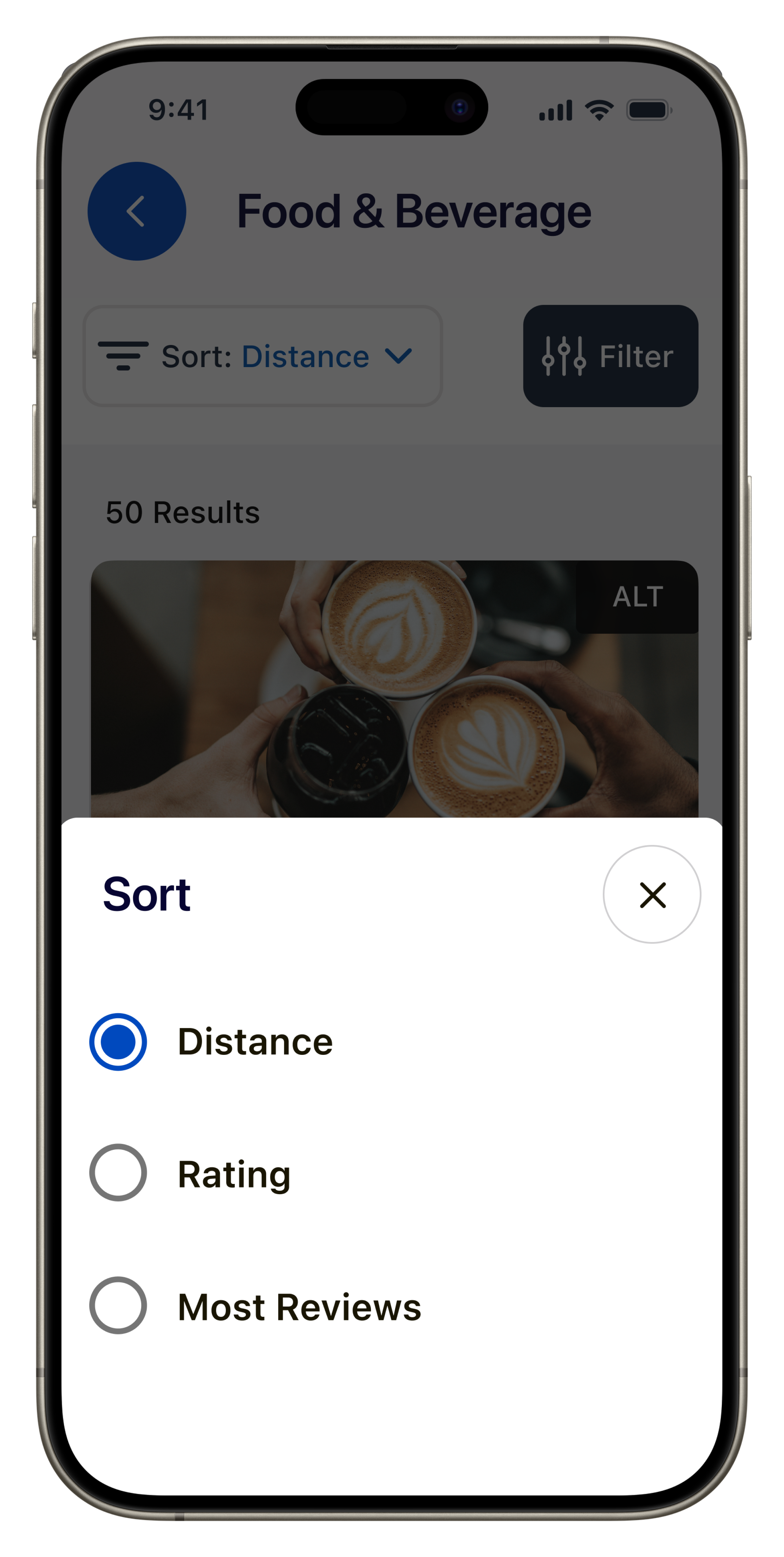
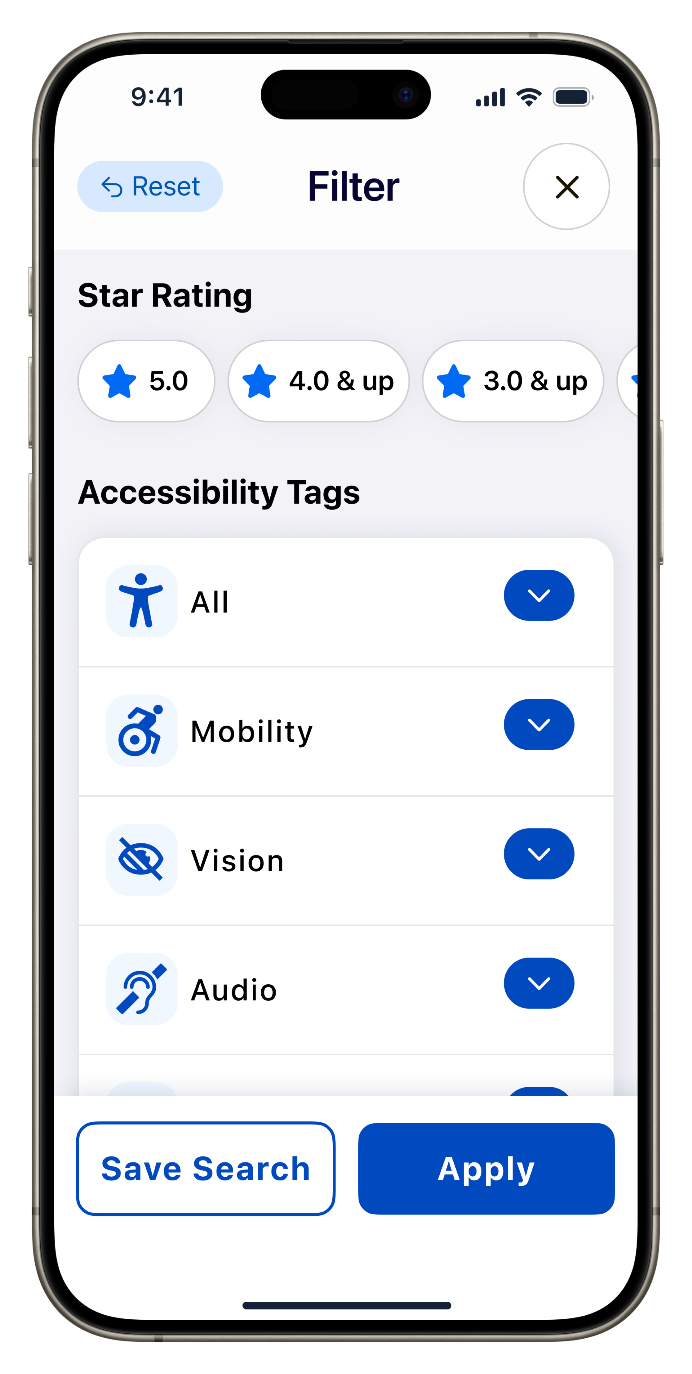
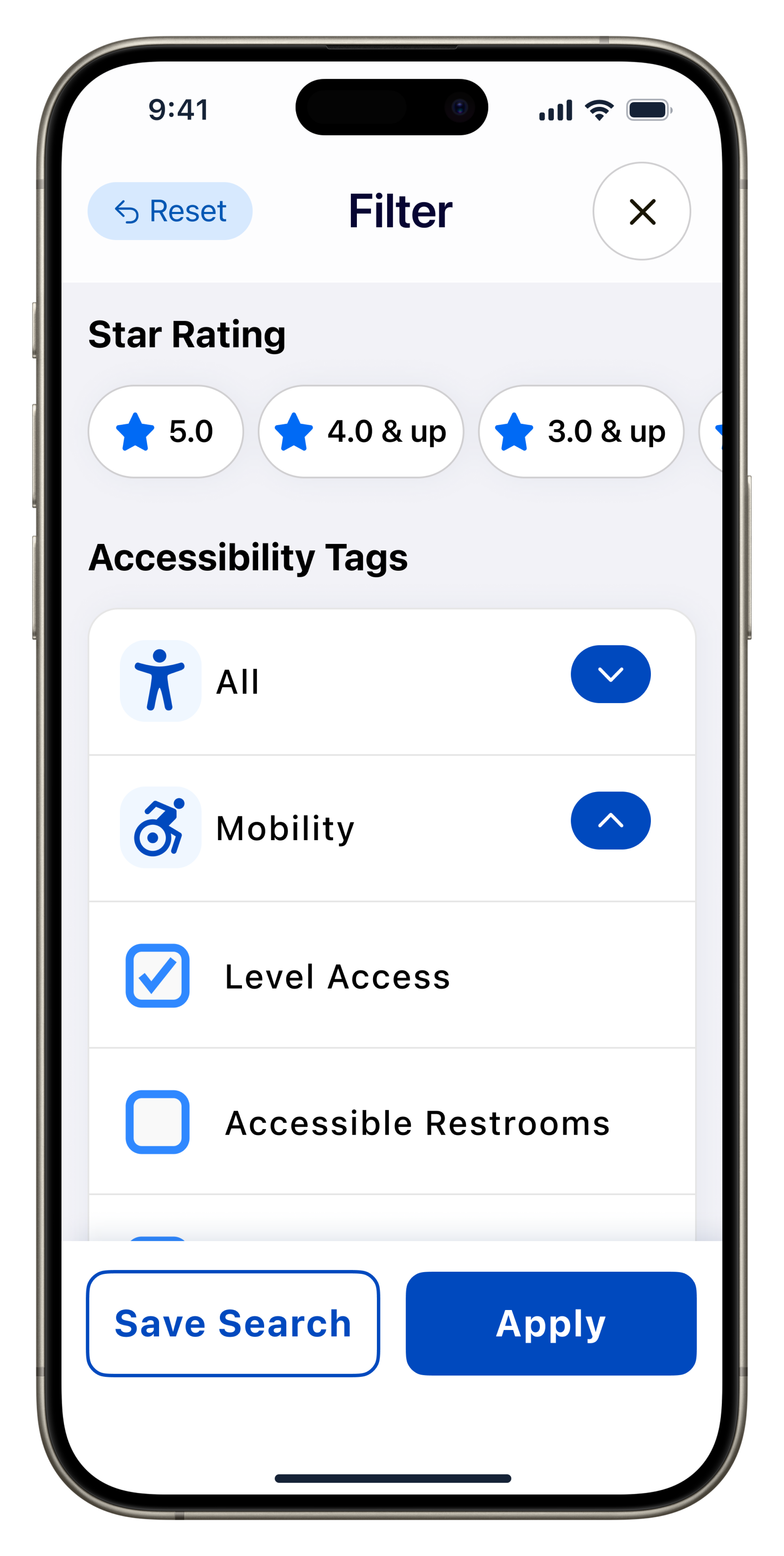
Filter/Sort
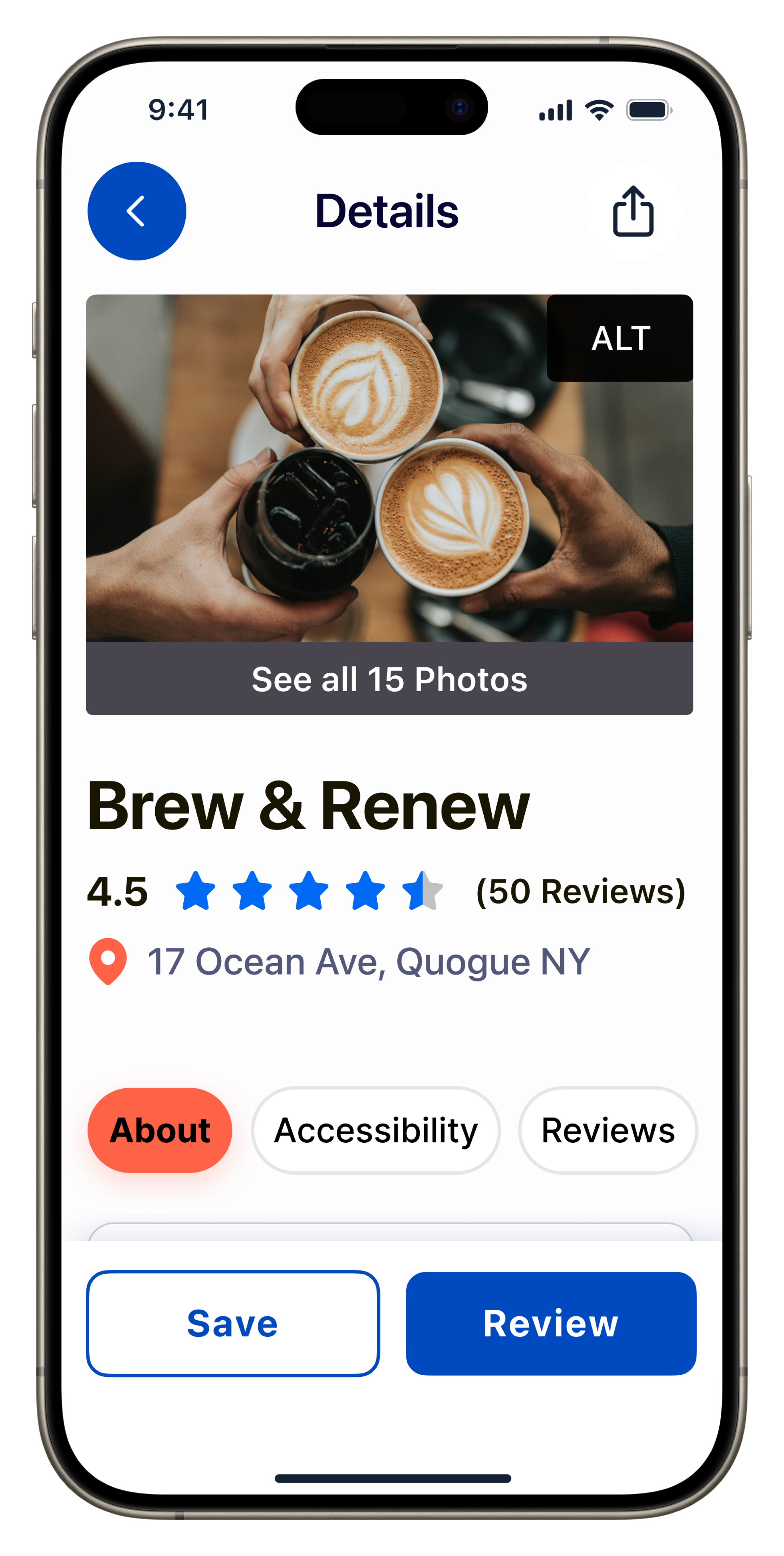
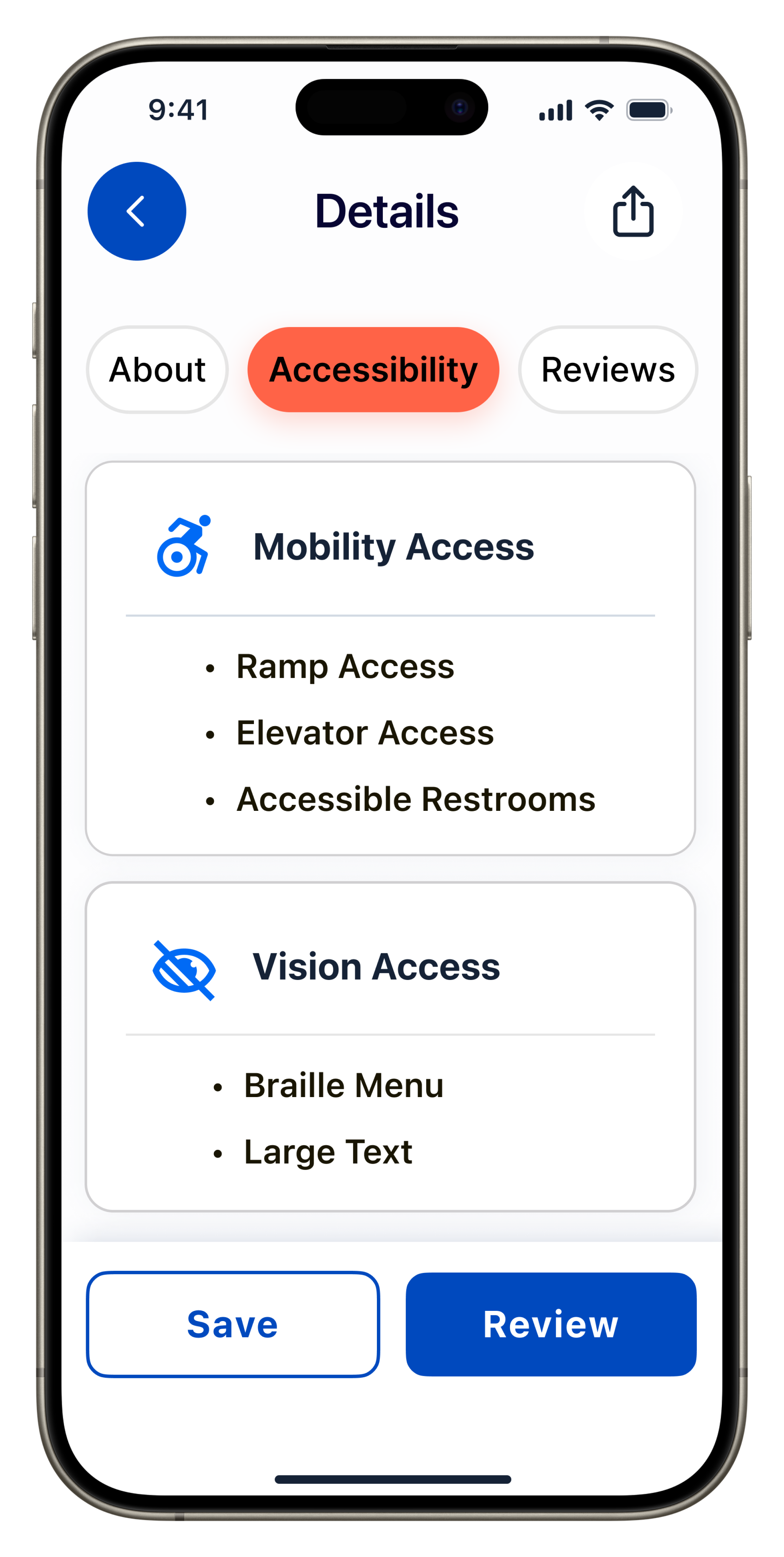
Location Details


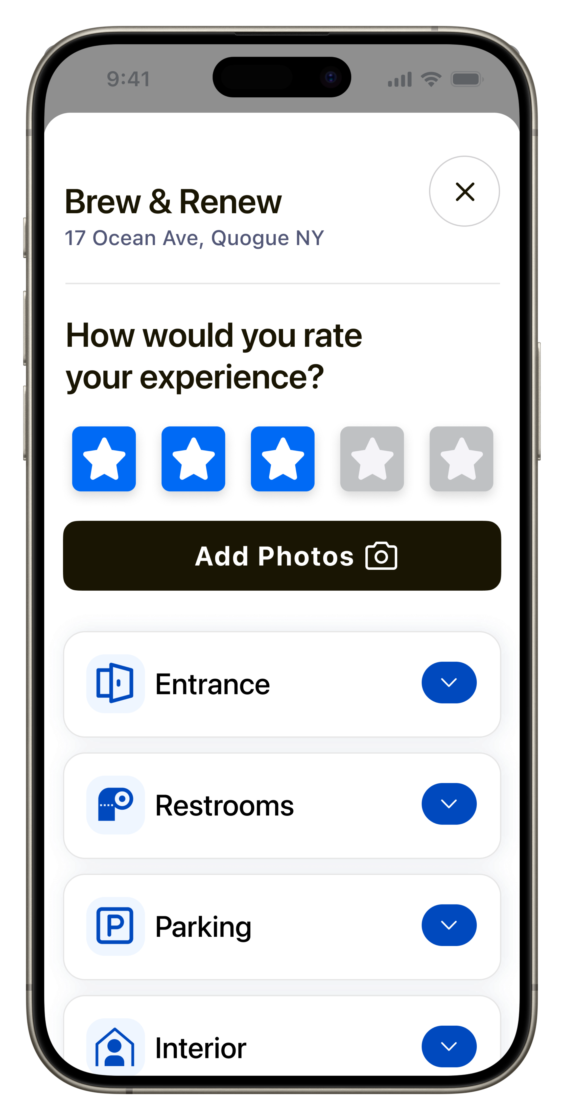
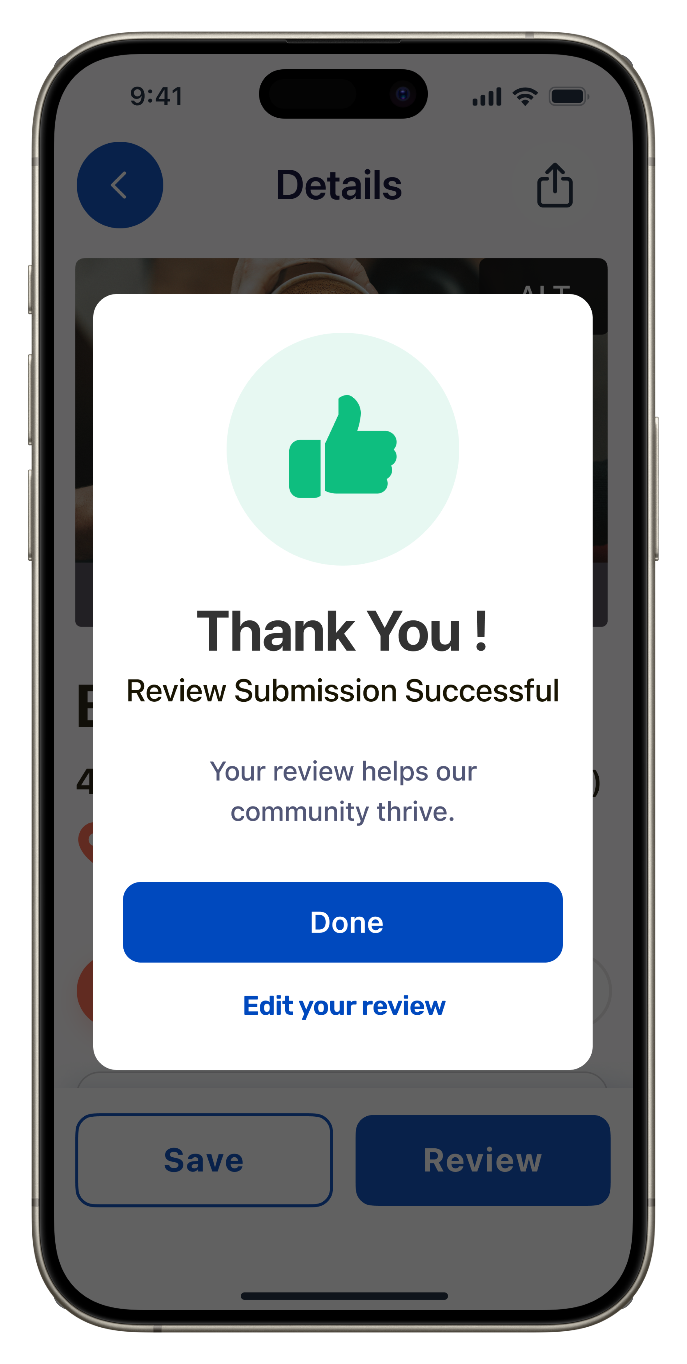
Rate & Review

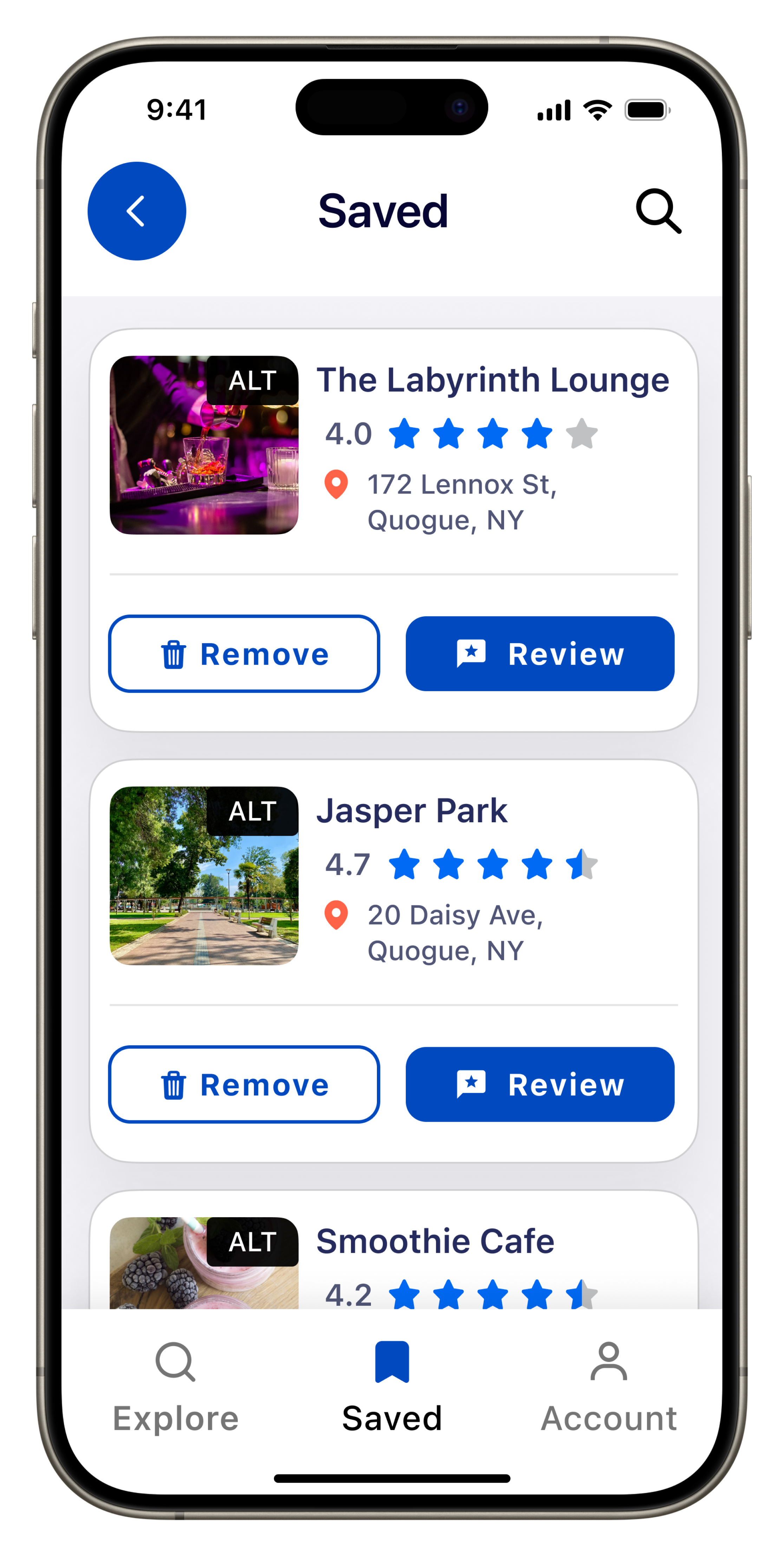
Bookmark/Save/Account


Takeaways
Working on this project has been an eye-opening experience for me. I have gained a deeper understanding of the importance of designing for accessibility, and I'm committed to making sure that my designs are inclusive and accessible to all users. Although I still have a lot to learn about accessibility design, I'm grateful for the opportunity to learn and grow, and I'm excited to apply this knowledge to my future designs.
Special Thanks
Special thanks to Matt Conlin, Accessibility Specialist and adjunct professor. He was my muse for this project and he gave me valuable insight and feedback throughout the whole development process regarding accessibility. He guided me to valuable sources to better research my topic.