Via Eurasia
Mobile App Redesign
The Via Eurasia app redesign project aims to provide a seamless and enjoyable user experience while revitalizing the app's look and feel. The Cultural Routes Society has extended a major European cultural route, the Via Francigena to Turkey to make a new Cultural Route called the Via Eurasia. The program emphasizes cooperation, cultural exchange, and sustainable tourism.
My Role

Redesign the existing Via Eurasia mobile app and craft visually appealing designs, ensuring brand consistency, accessibility, and responsiveness.

Project Overview
About
The NGO Culture Routes Society needs to redesign several parts of its app, Via Eurasia. The MVP of Via Eurasia had some success, but a recent acquisition has provided an extra budget to revitalize the product.
The Problem
Based on user feedback, it has been revealed that the app's navigation is confusing due to an excessive number of screens. Additionally, the branding gives off an outdated and unsophisticated impression, while the chosen colors do not adhere to accessibility guidelines. Also, users said the "Home" page of the app resembles a legal document.
The Goal
Design a new product that is both user-friendly and visually appealing. The navigation will be less confusing, and we'll get rid of those extra screens. We're going to update the branding to make sure it's accessible to everyone.
Branding Revamp
With the original branding feeling dated, my goal was to give it a fresh update while staying true to the essence of Via Eurasia.
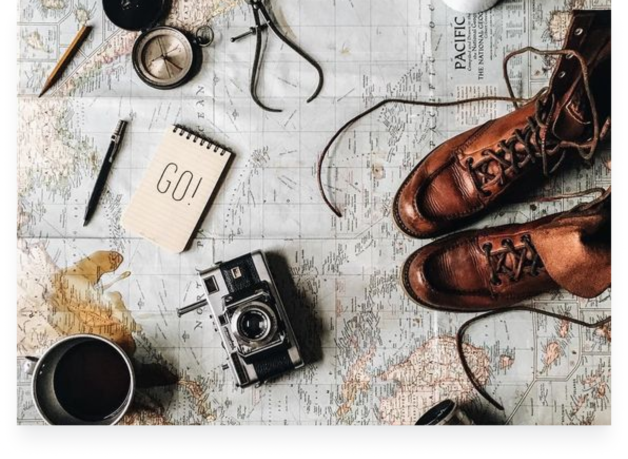
The brand is all about embracing authenticity, sustainability, and a genuine commitment to preserving history.


Colors
-
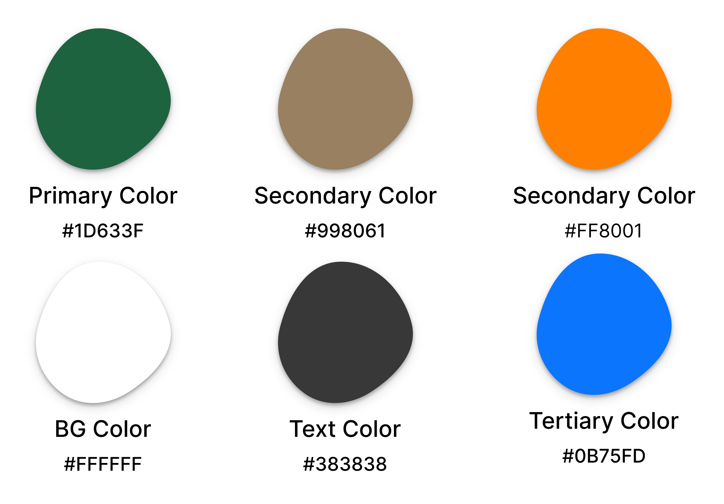
Before
Users have pointed out that the colors come across as outdated and lacking sophistication, while also not aligning with accessibility guidelines.
-

After
I aimed to preserve the earthy tones while modernizing the color palette to ensure better accessibility.

Logo
Original Logo
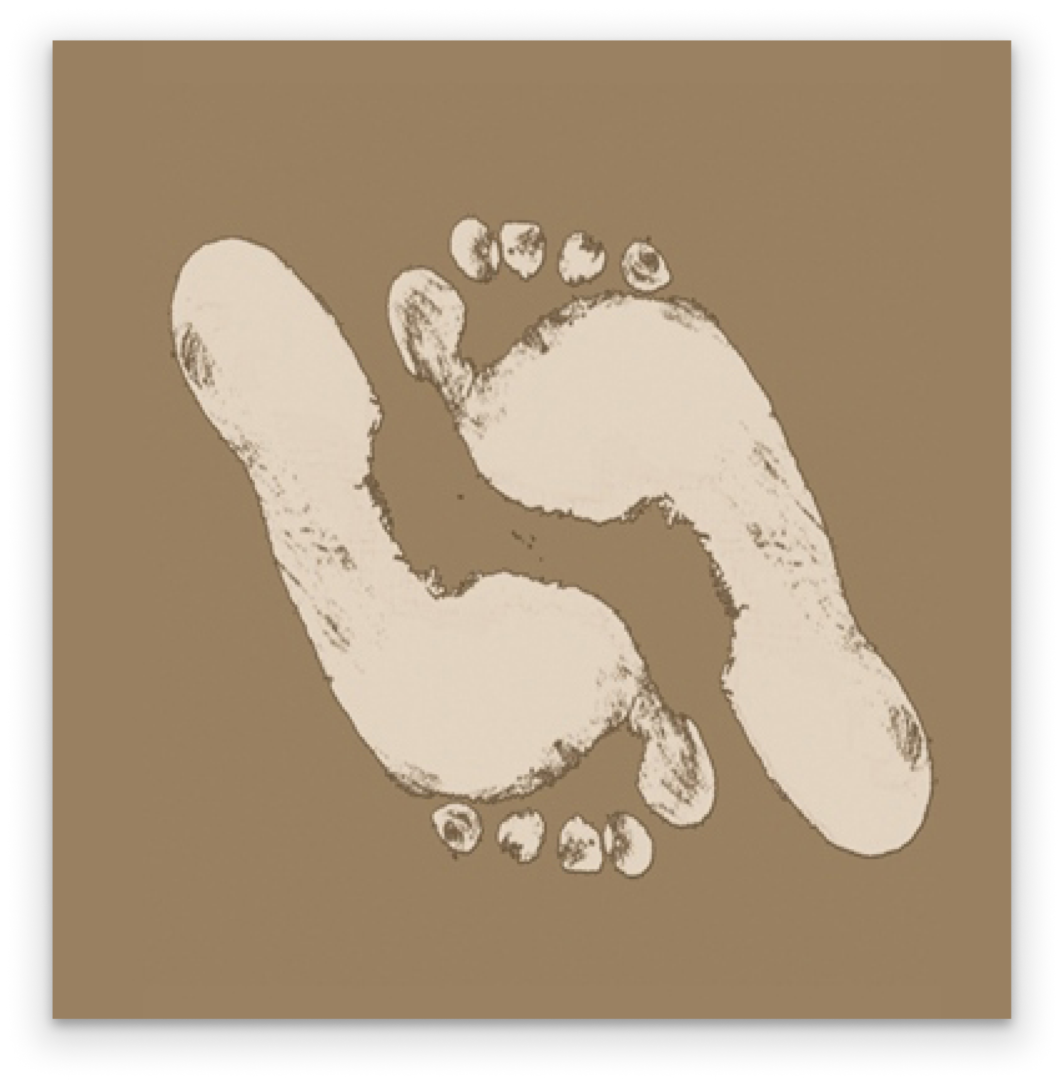
The logo colors have an insufficient contrast ratio of 2.57:1, making them inaccessible. Additionally, the meaning conveyed by the logo is ambiguous.
New Logo
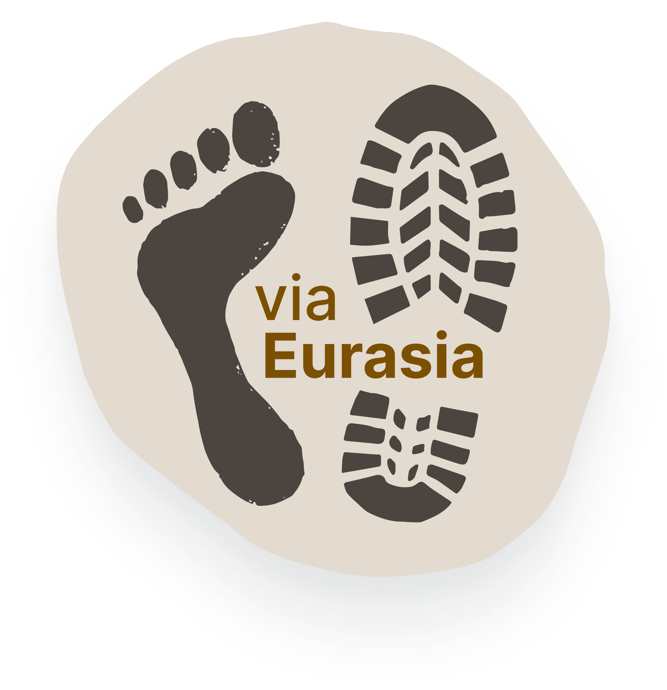
Preserving the original logo idea of footprints, I’ve given it a facelift to clarify its meaning.
The new logo features one bare foot and one boot, symbolizing one foot in the present and one in the past, representing the rich history of the Routes.
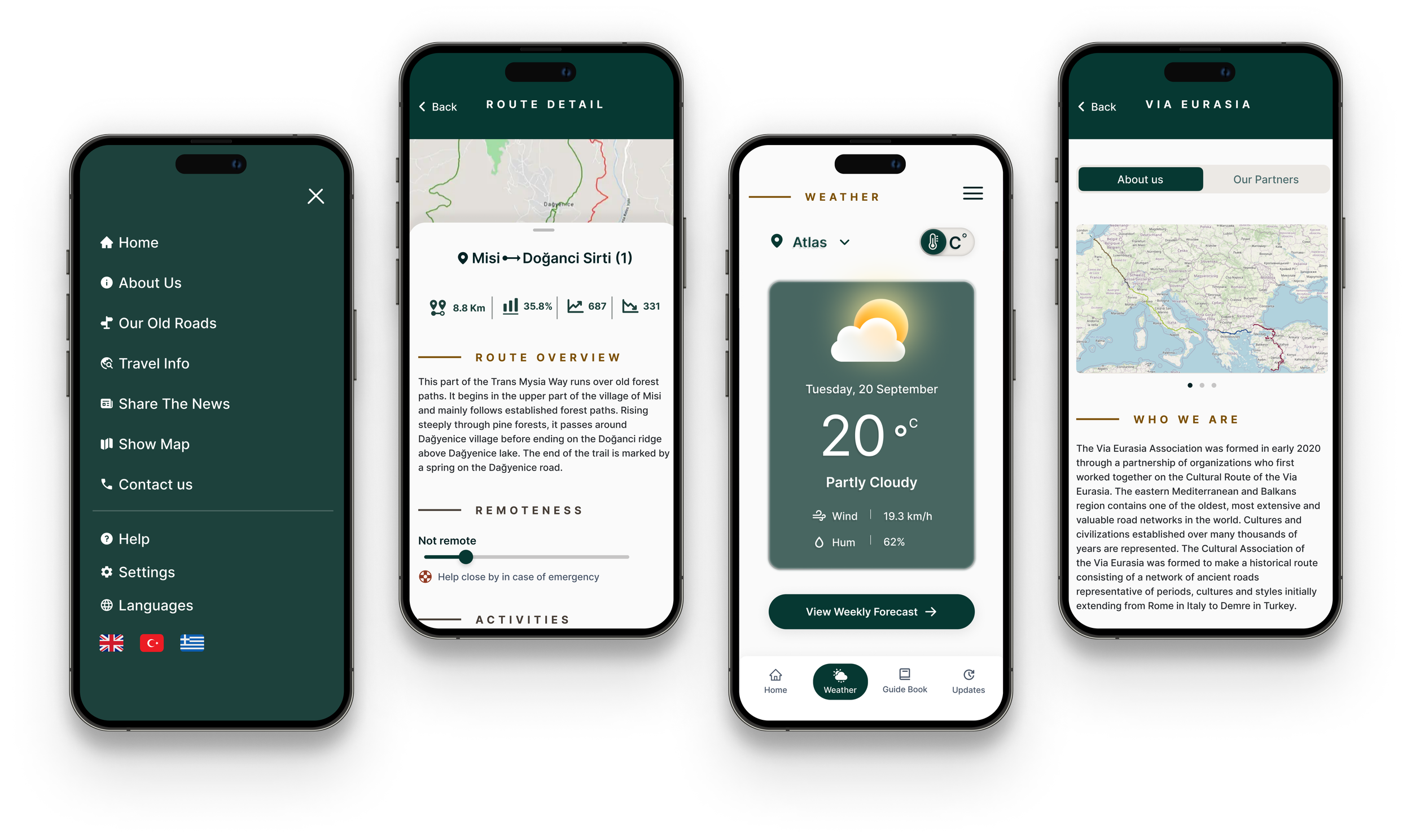
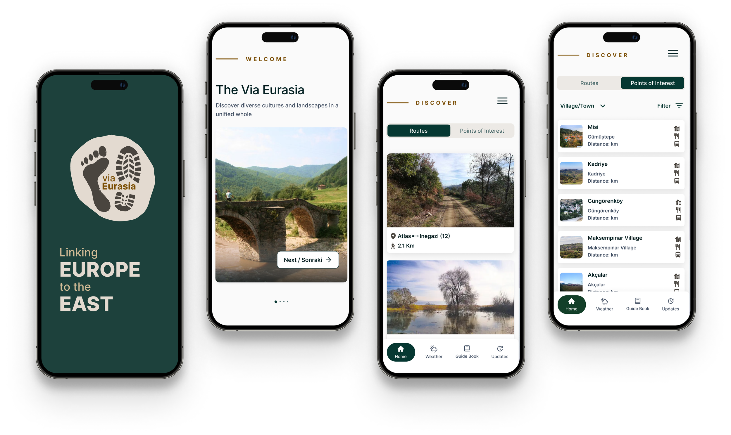
Screens


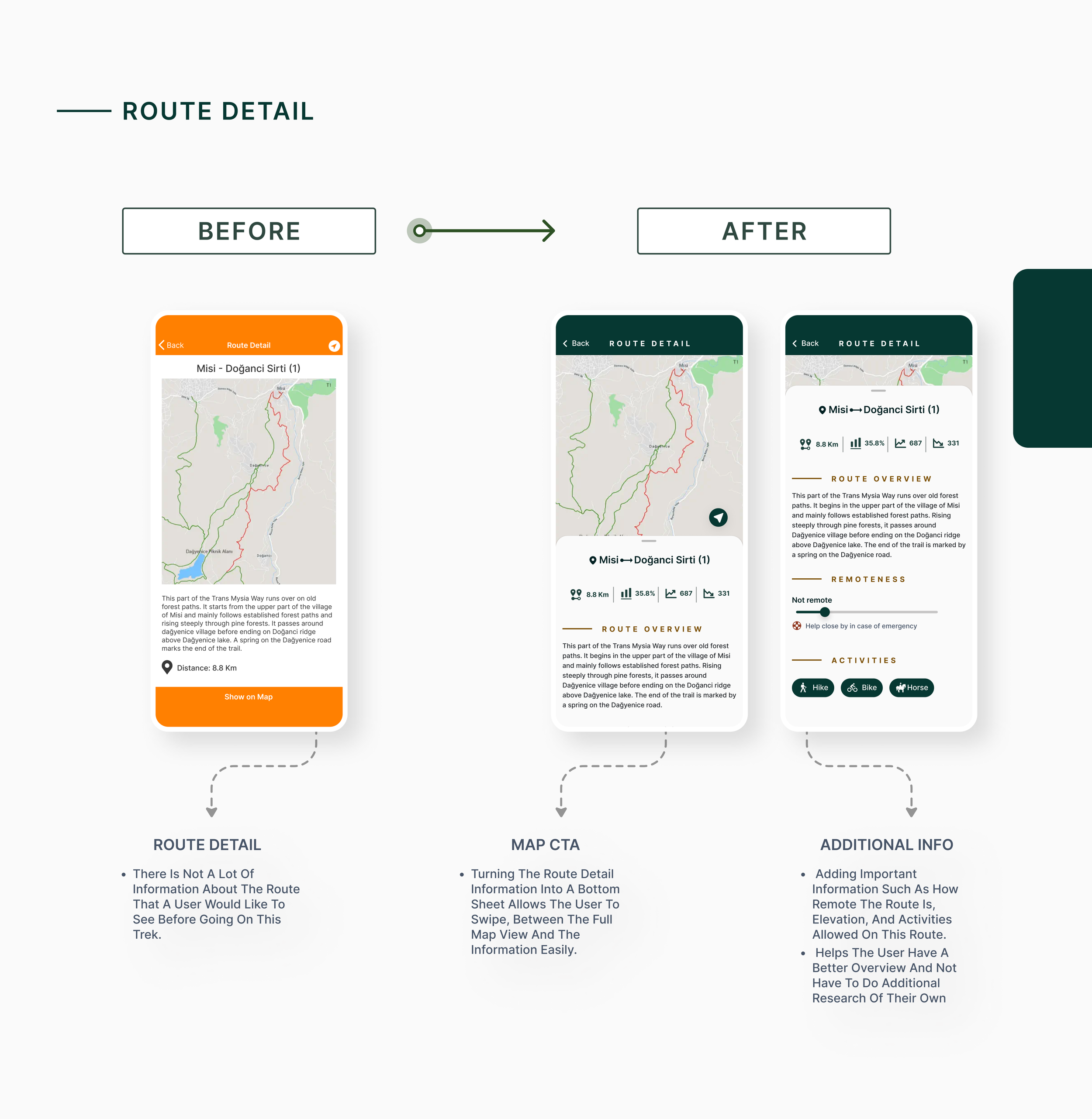
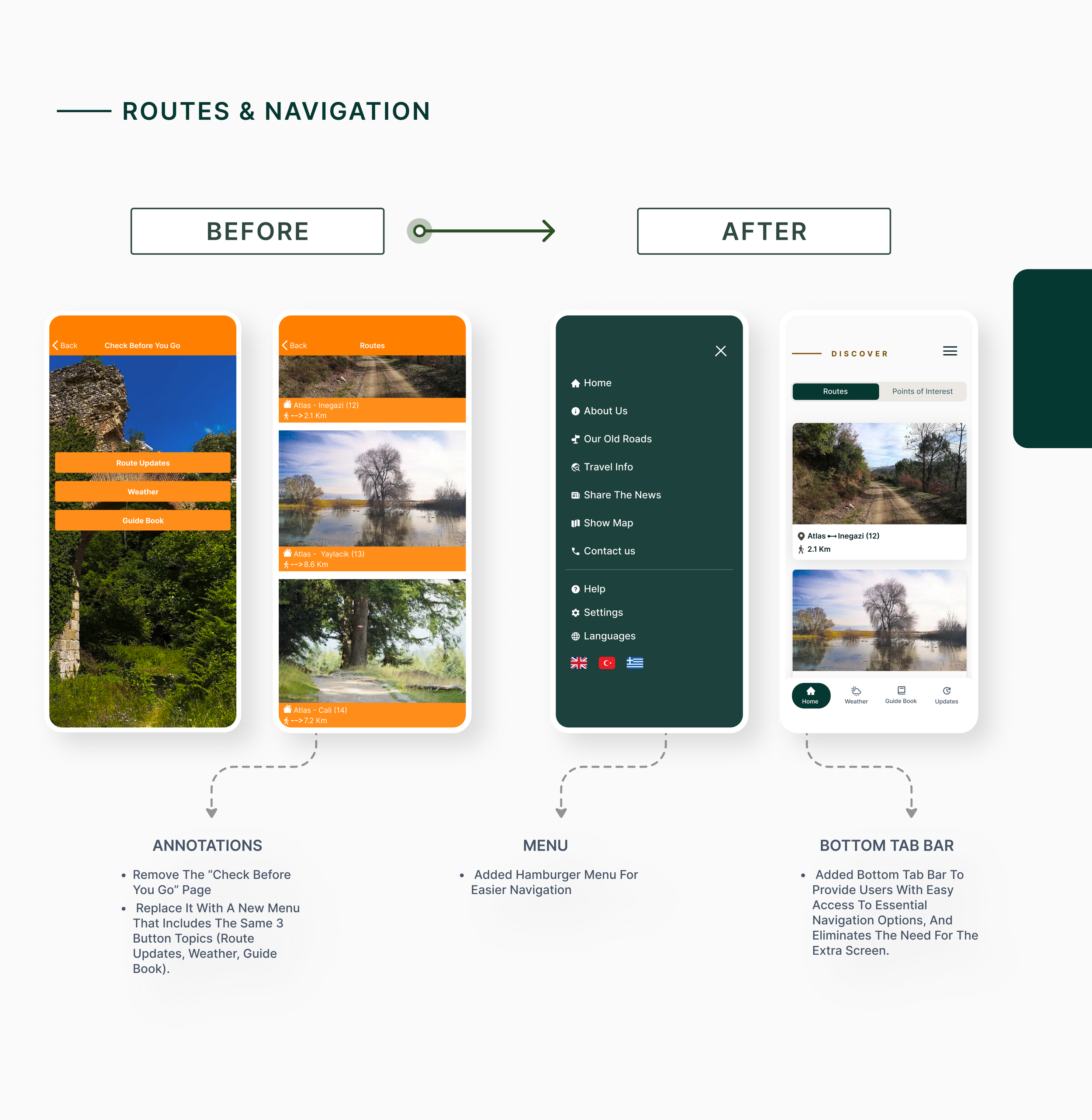


Final Screens
Interactive Proto
I had a great time exploring various micro-animations for the interactive prototype. With the freedom to experiment and learn, I got lost in learning new ways to enhance my prototypes.