


Project Overview
Pantreats is a responsive baking app that offers ingredient substitutions and personalized recipes based on available items. The project combines responsive design with practical baking solutions for a seamless experience.
My Role
UX Design, UI Design, Wireframing, User Research, A/B Testing
Tools

My Process
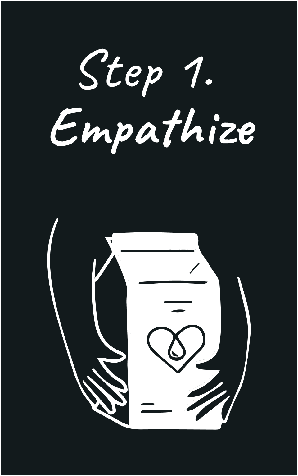


Research

User interviews were conducted with 8 participants via Zoom to gain insight into their needs, behaviors, and challenges. Ten questions were asked during the interviews.
User Interview Questions
How often do you bake? (Amount per month)
What device do you usually use when viewing an online recipe?
Do you normally substitute ingredients in a recipe? If so, why?
Do you prefer experimenting with new recipes or sticking to familiar ones?
Do you base your decisions to try a recipe on ratings or comments?
Do you choose recipes based on the ingredients? If so, why?
Would you go to the grocery store just to buy ingredients for a specific recipe?
Do you share recipes with your friends and family or on social media?
Is there anything about recipe websites that frustrates you?
What are your preferred web apps for discovering new baking recipes and what do you like about them?
Key Insights
Goals
-Offer alternate ingredients/ substitutions on the recipes
-Offer unit conversion
-Users prefer not to go grocery shopping
Frustrations
-Too many words, ads or text
-No substitution options available
-Not enough recipes for specific diets/lifestyles
Trends
-Base their decision to try a recipe on comments/ratings
-Save their recipes on Pinterest but wouldn’t mind a way to save on a site
-Don’t like long wordy intros to recipes
Surprises
All the users showed interest in trying recipes with substitute ingredients if it’s offered in the recipe, but would normally not substitute unless given the option
Define
Who is the user?
People who want easy baking recipes using pantry ingredients for time, money, and health reasons.

THE PROBLEM
Users do not want to search through hundreds of baking recipes until they can find one that has all the ingredients they have on hand.

THE SOLUTION
Create an app that simplifies recipe search based on available ingredients. Recipes are filtered for ingredient match, saving time and effort.
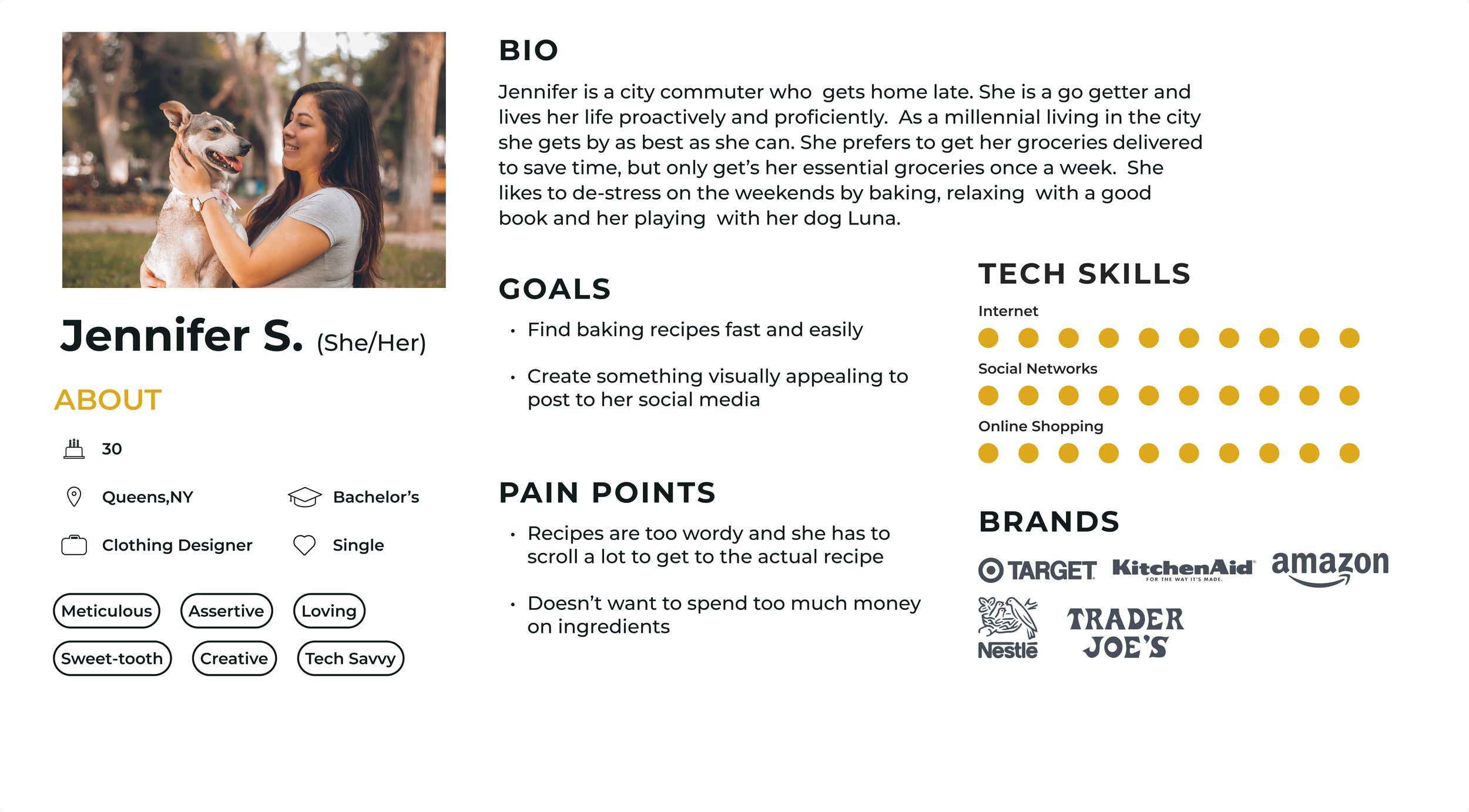
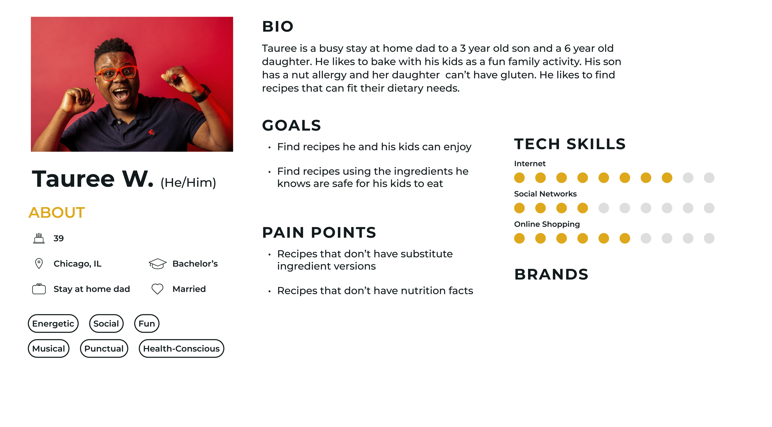
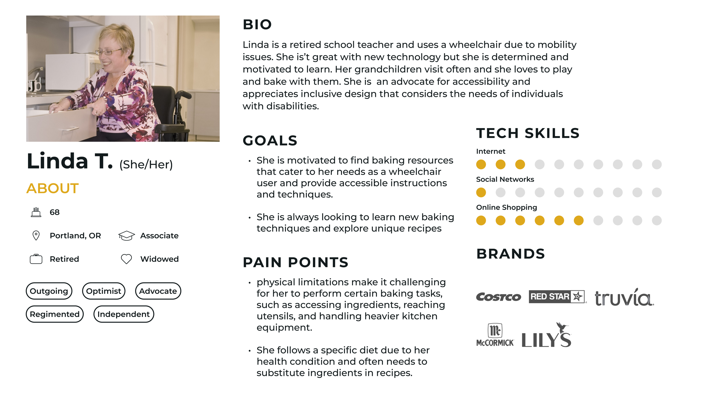
User Personas
After analyzing the data gathered from interviews, I created three user personas to gain a clear understanding of my target audience.

User Journey Flows
Site Map
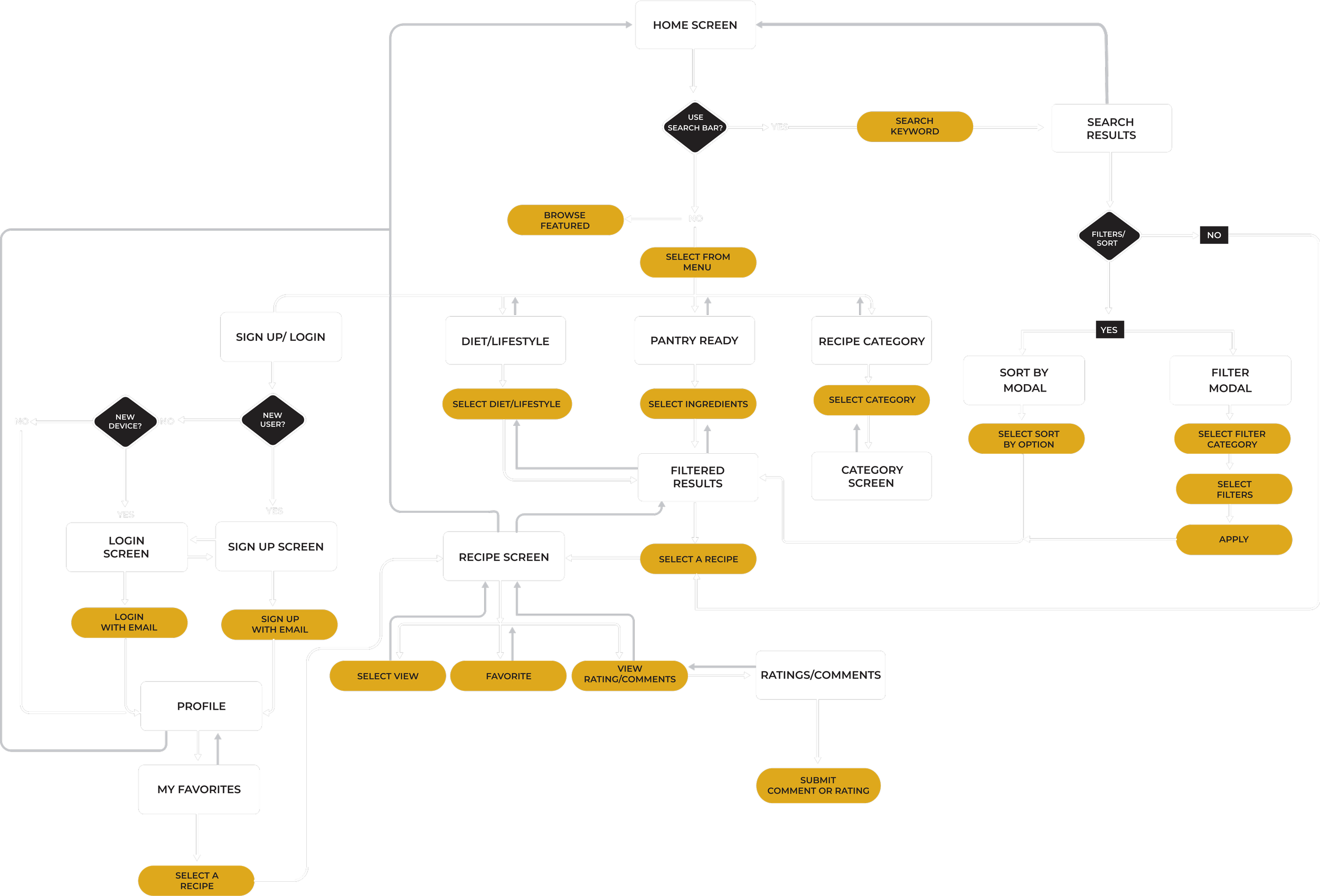

User Flows

JTBD 1: “When searching for baking recipes, I can quickly filter them by ingredient.”
Entry Point: Home Screen
Success: Select ingredients and find a recipe

JTBD 2: “When I discover a recipe, I prefer having a list of alternative ingredients to choose from. This way, I can select the one that suits me best.”
Entry Point: Recipe Screen
Success: View alternate ingredient suggestions

JTBD 3: “I’m so tired after work but I would really like to bake some cookies, I would like to find a recipe I can make in under an hour.”
Entry Point: Home Screen
Success: Find all cookie recipes that take under 60 minutes
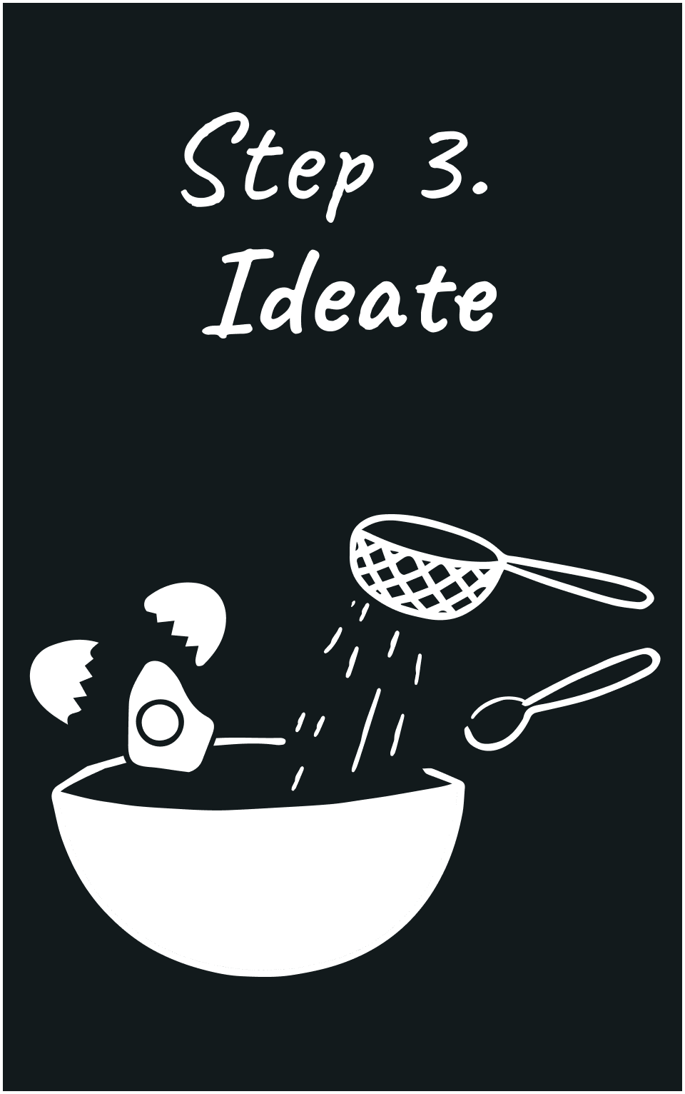
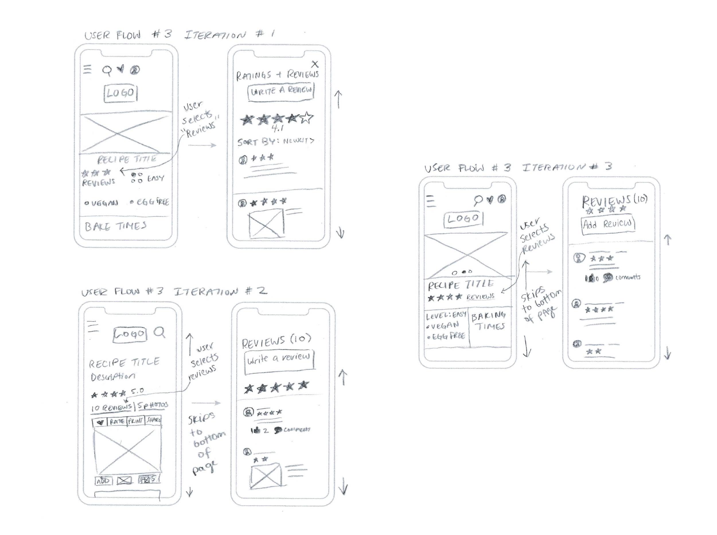
Wireframing + Ideation
Once I had identified the main Jobs to be Done, I proceeded to create sketches and wireframes.
User Flow 1

User Flow 2

User Flow 3
Rapid Prototype

Usability Testing
Objectives
The goal of the usability testing was to assess how users interact with the app, identifying usability issues and areas of confusion. This feedback will guide design refinements to enhance the overall user experience.

Test Findings
Issue 1: Filter by Ingredient
Across the board finding the filters was an issue. The design was not intuitive to the user. When given the task “You want to bake something but don’t have time to run out and buy ingredients. Find a recipe using ingredients you already have in your pantry” users struggled to find the filter.
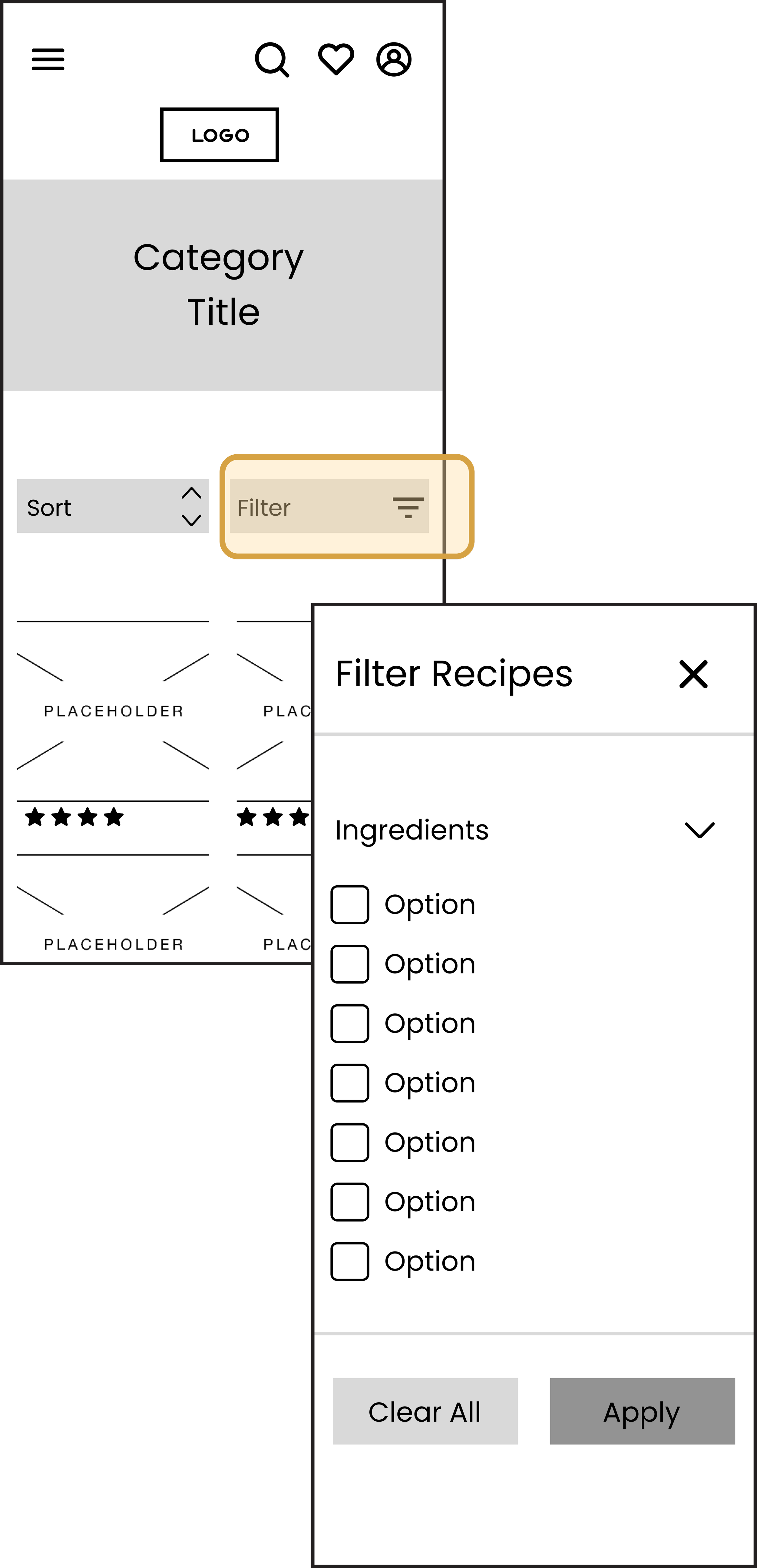

Suggested Fix
Adding these options to the main menu would solve this issue as it wouldn’t take as many clicks to find.
Issue 2: Top Navigation
Some users didn’t see the top navigation bar right away and when given the task; ”You want to create a profile so you can set your dietary preferences and save your favorites” they struggled to find their profile.

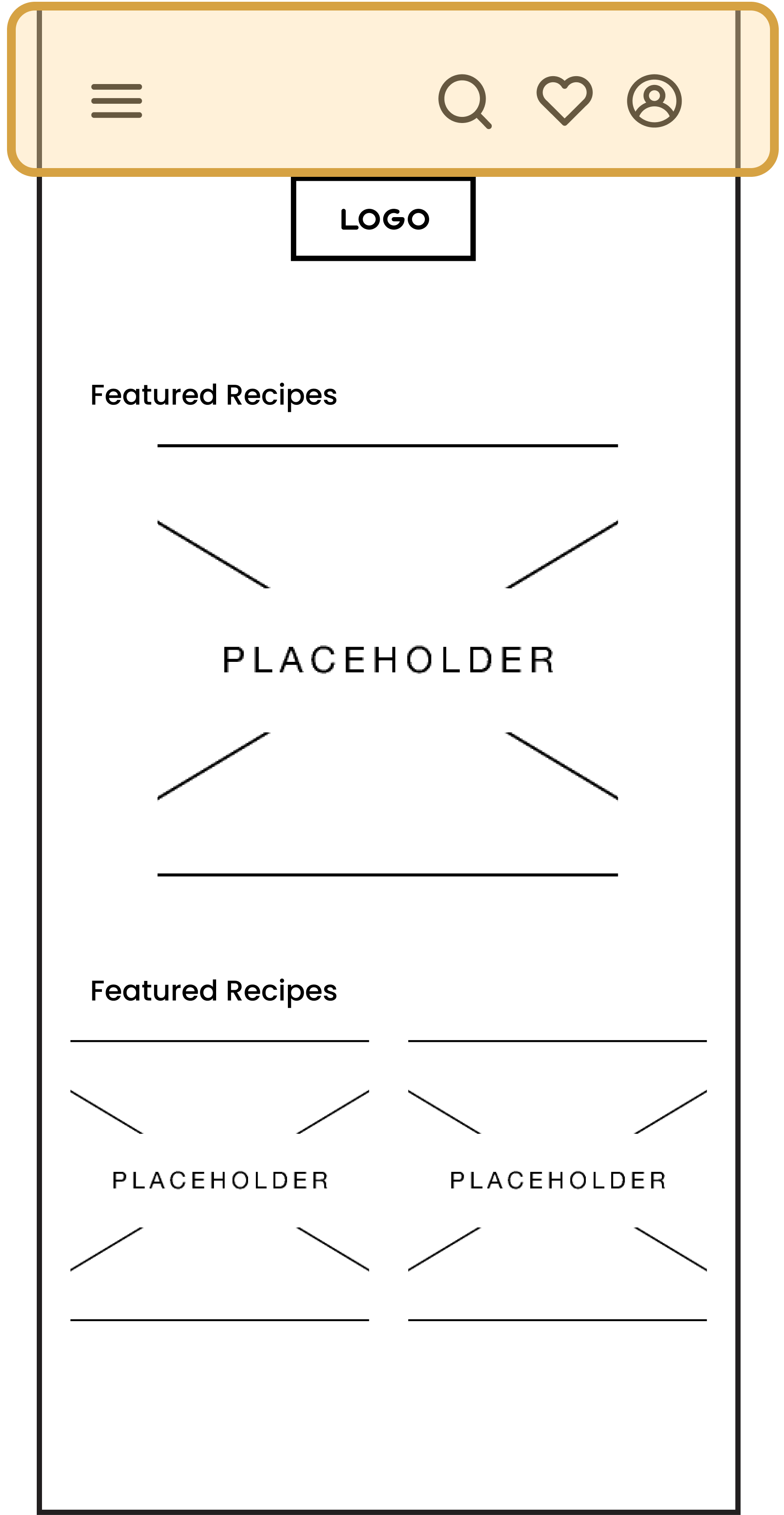
Suggested Fix
Instead of having a navigation bar with icons for favorites and profiles, I am considering placing the main menu and the search icon on the bar and moving the profile and favorites options under the menu. All users, except one, instinctively looked for these options in the main menu instead of using the navigation bar at the top.
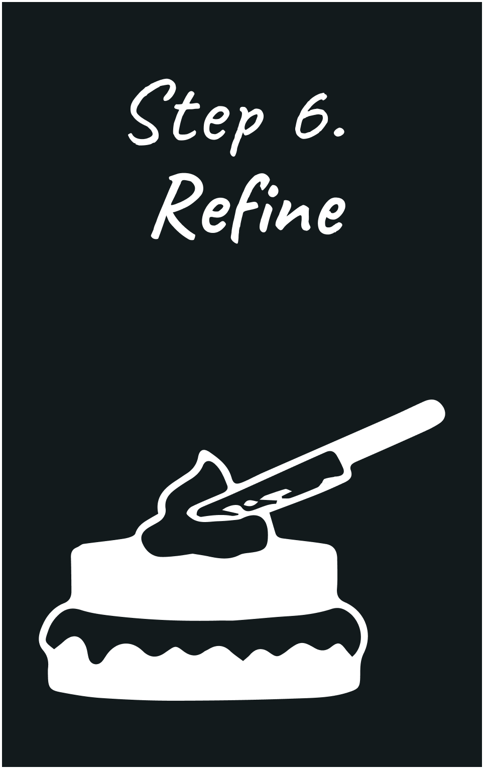
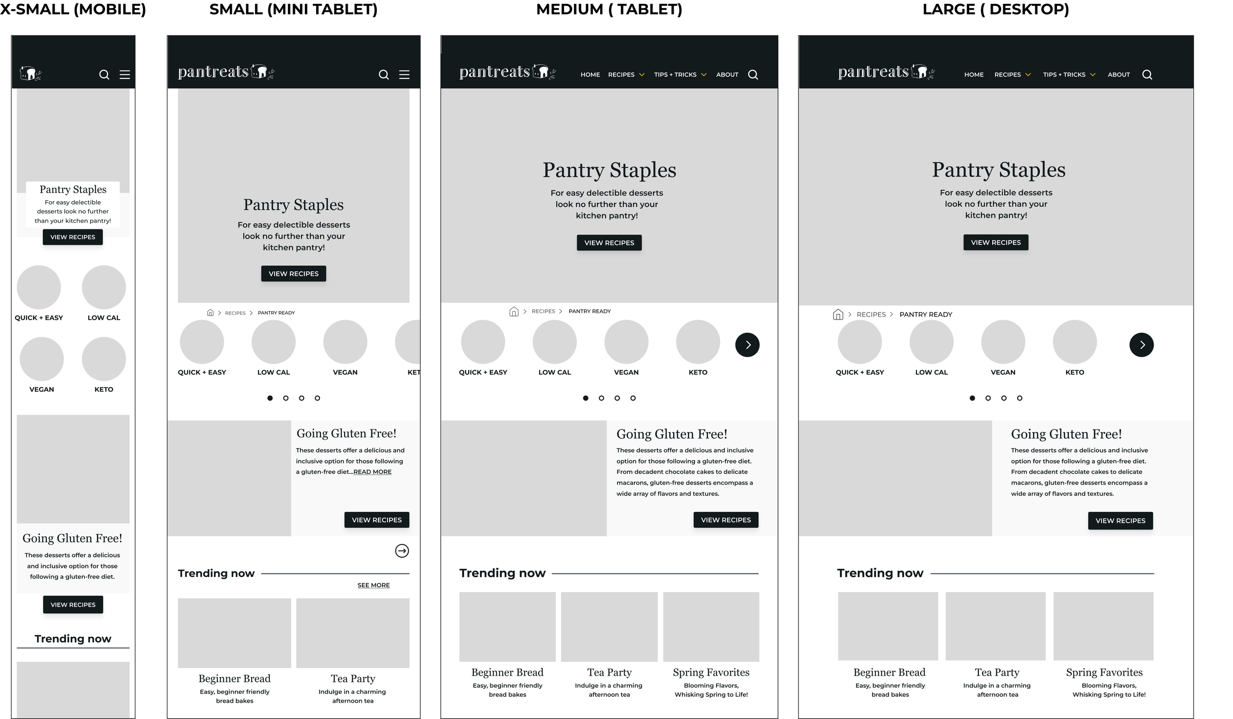
Responsive Wireframes
After reviewing my usability test findings, I updated the mobile wireframes and created Mid-Fidelity wireframes for all responsive breakpoints.
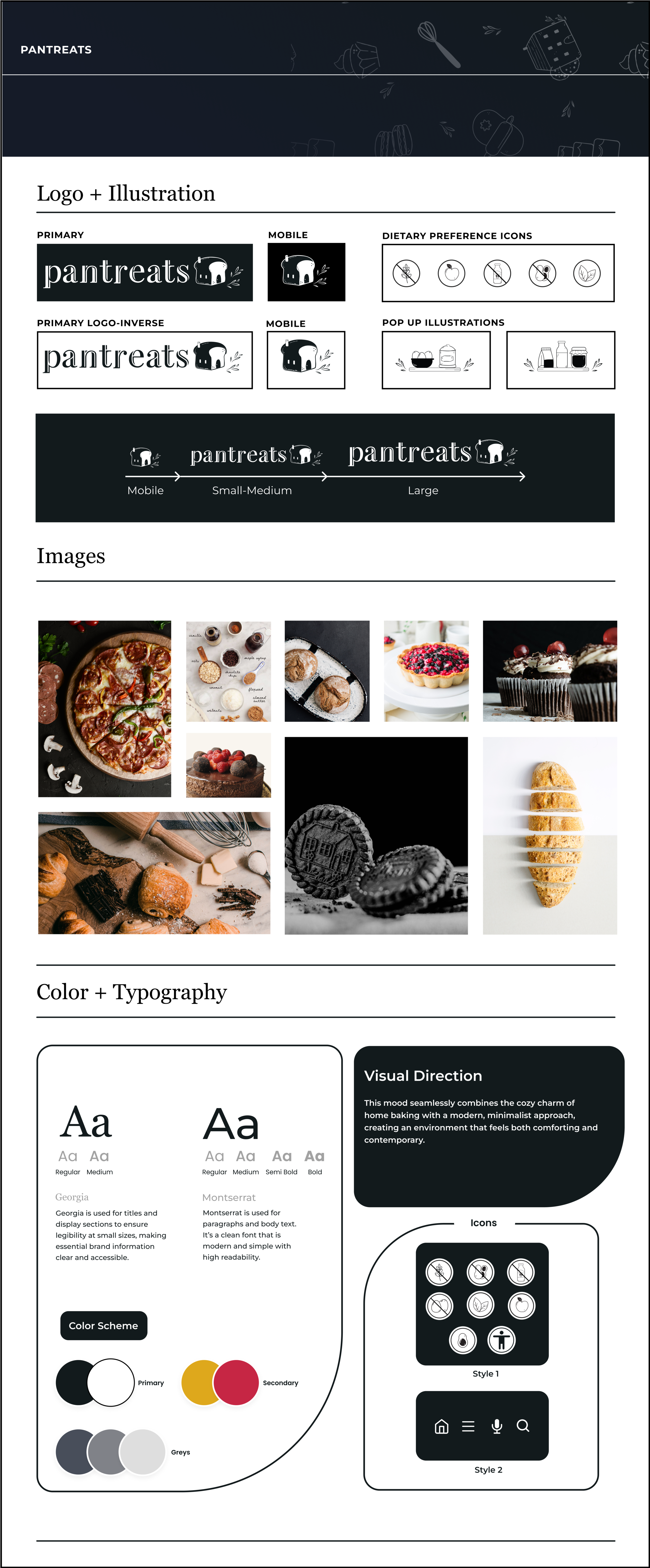
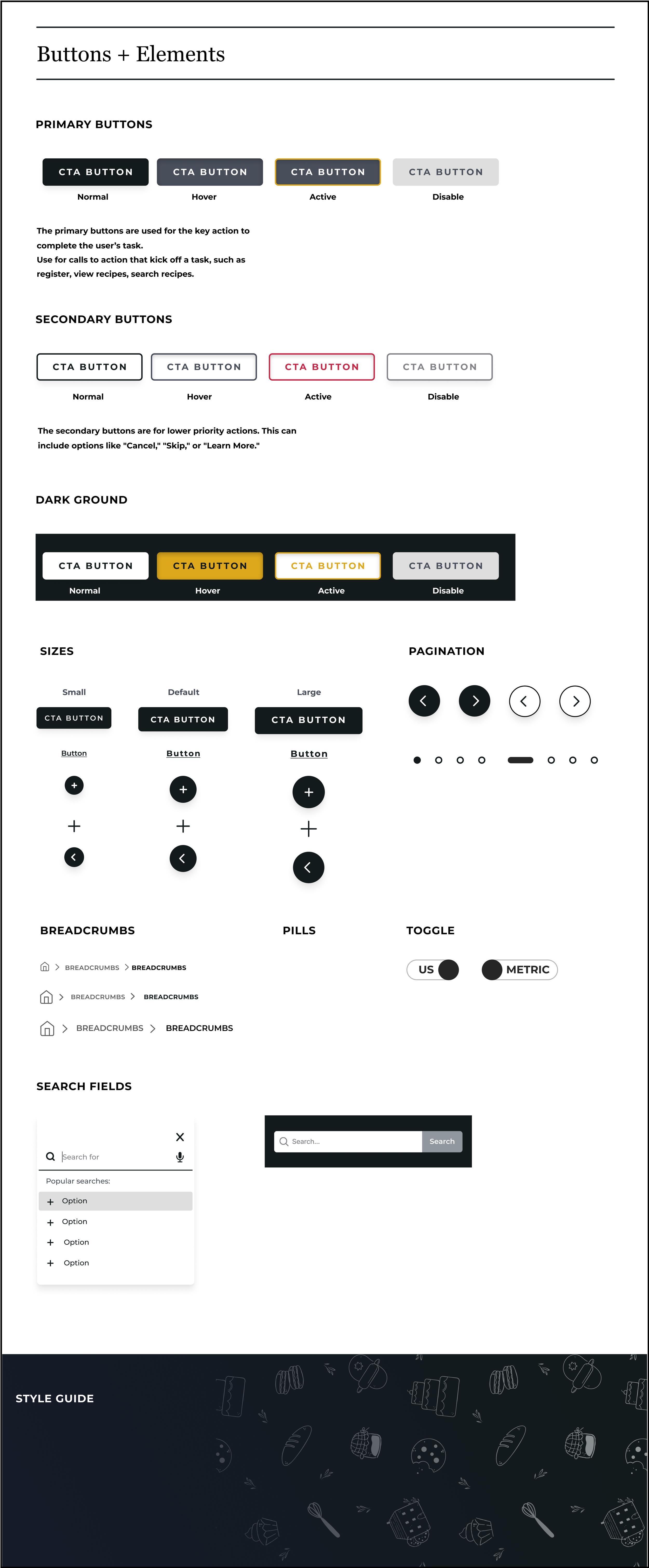
Style Guide
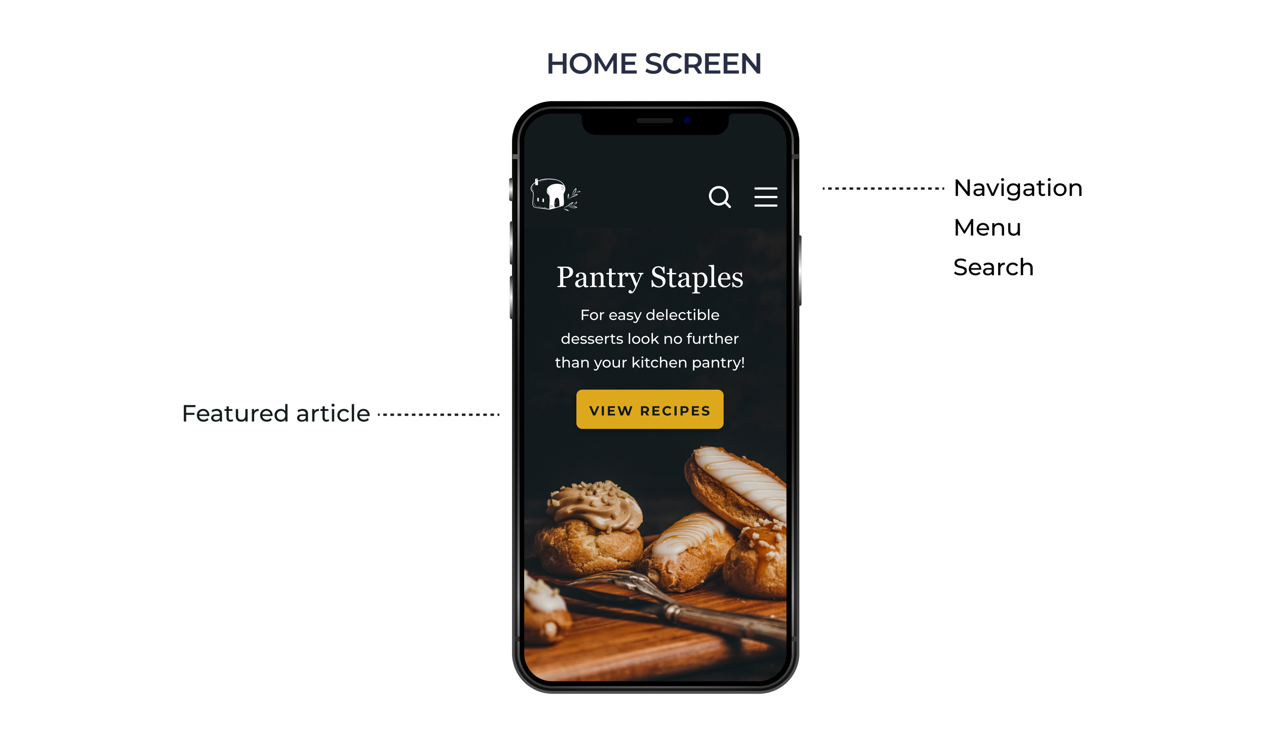
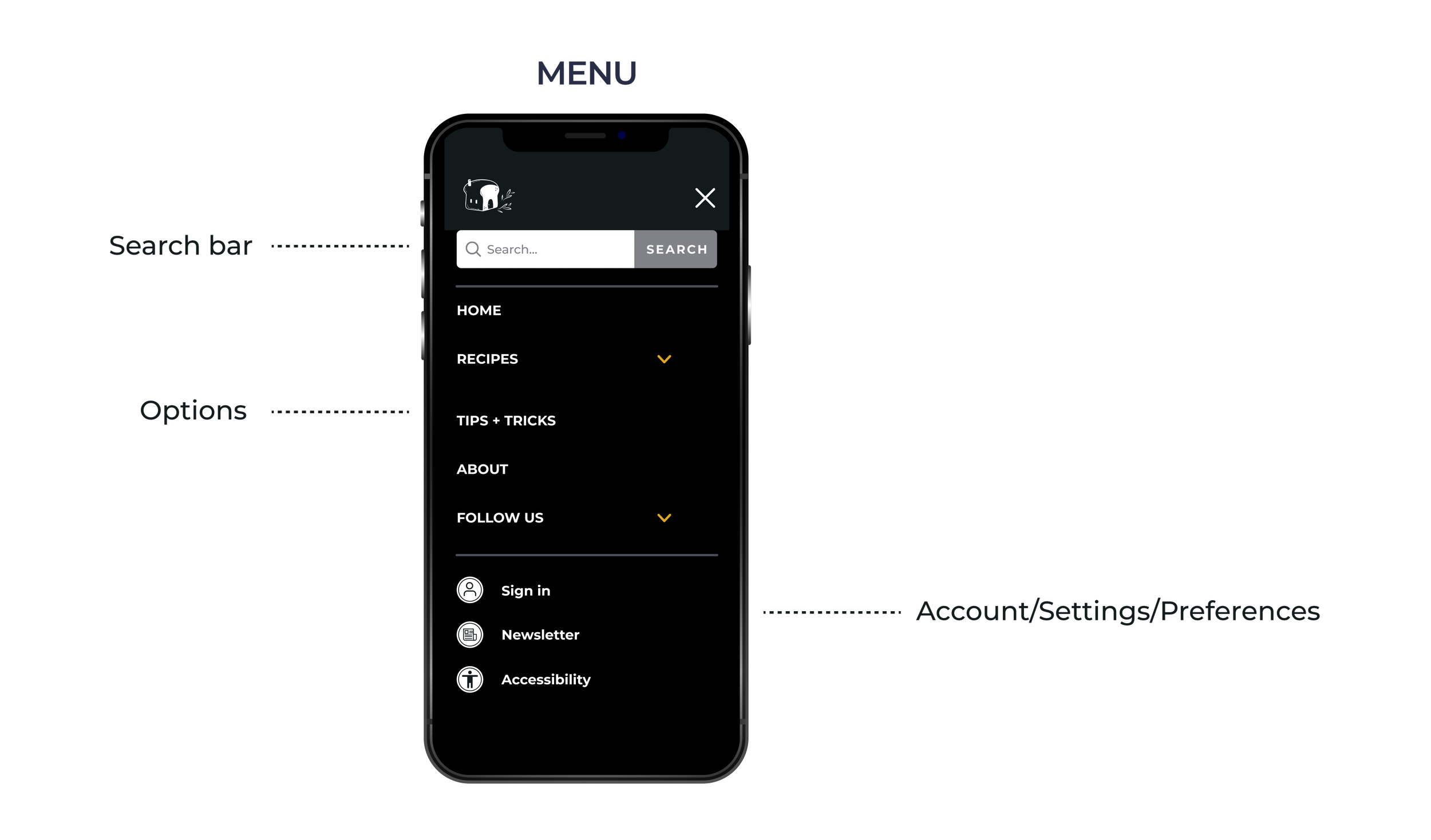
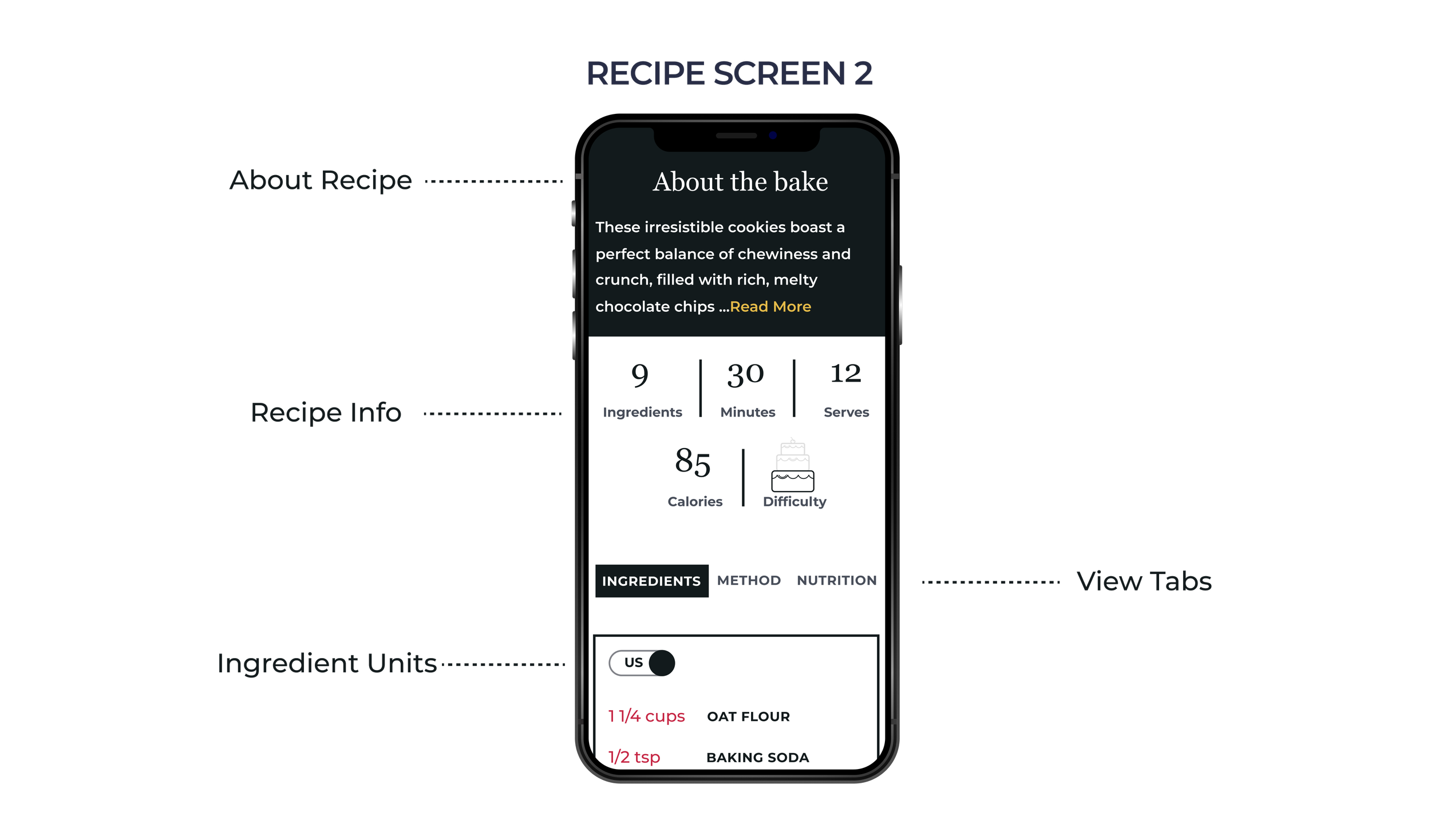
Main Screens + Functionality


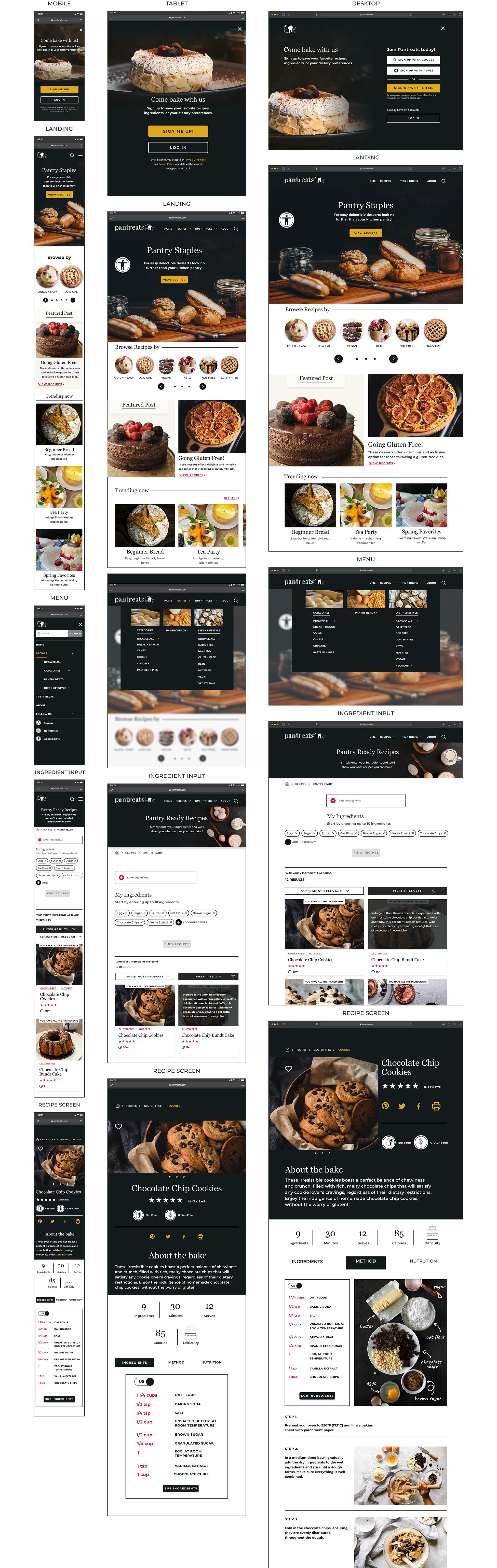
Hi-Fidelity Responsive Screens

Takeaways
Working on this project enhanced my responsive design skills and deepened my understanding of user-centered design. User feedback, interviews, and preference testing influenced my design decisions, ensuring the app met user needs. Early user involvement allowed for me to identify errors and improve accessibility. This project honed my skills and reinforced the importance of user-centric design.